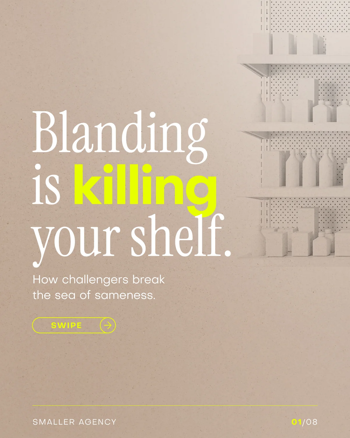
Clean. Modern. Timeless. Three harmless words that have quietly turned half the shelf into camouflage.
Premium became a placeholder.
You know the look. Thin sans serif. Muted colour. Oceans of white. One tasteful illustration doing its best.
Nothing is technically wrong with it. That’s the problem. The same signals that once felt premium are now the fastest route to looking like everybody else.
The category leader can afford to disappear.
A shopper who can’t tell the difference usually reaches for the name they already know. Familiarity breaks the tie.
That means bland packaging doesn’t create a neutral result for a challenger. It quietly sends the sale to the biggest brand on the shelf.
Three ways out.
- 01Say what it is, fast.
Clever loses to clear at three feet. Put the category and useful benefit on the front. Make them big enough to survive a busy shelf.
- 02Add one weird thing.
A texture, character, phrase or shape people can point at and remember. Not random decoration. Something the brand can keep owning.
- 03Design for the shelf, not the screenshot.
Test the pack small, in clutter and beside the competition. The buyer meeting is not a flat-lay.