italian style, made to travel.
A national out-of-home adaptation that kept Peroni's elegance intact at the scale and speed of Canadian city media.
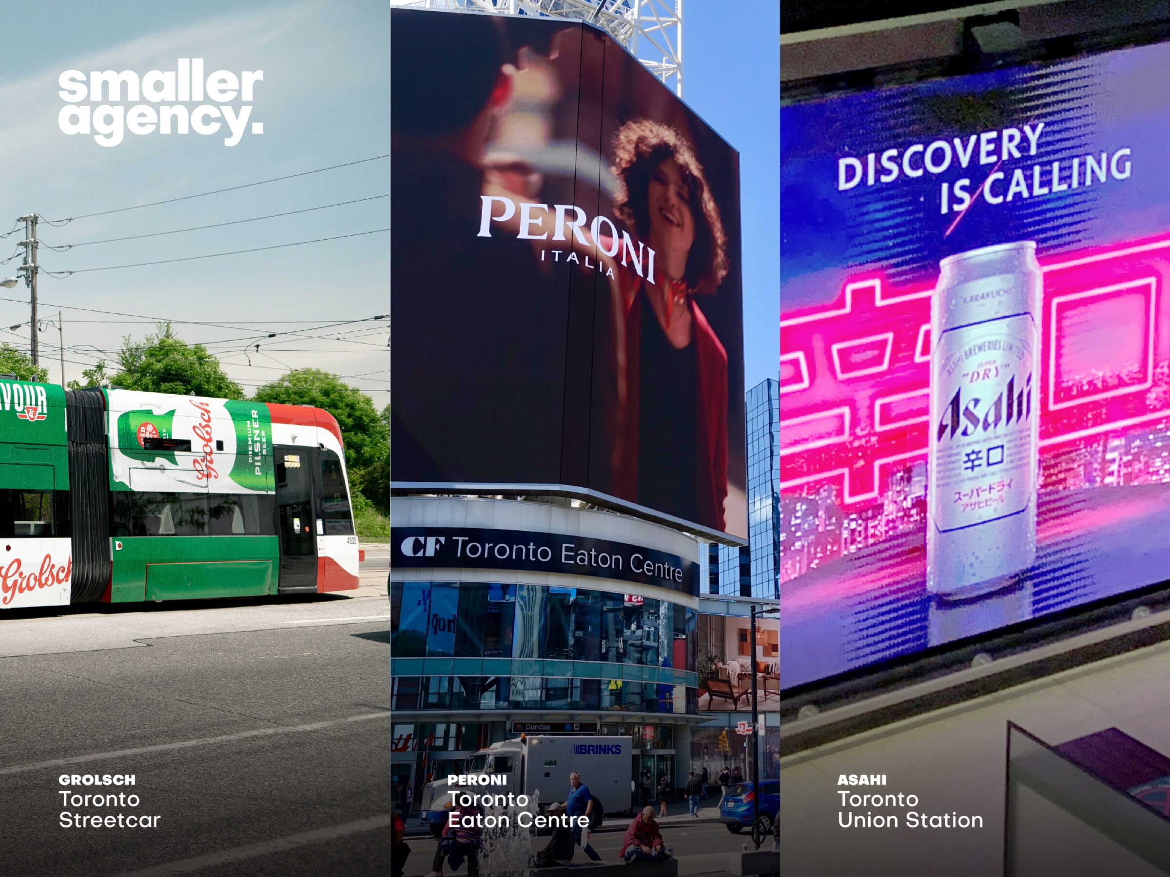
Translate a global premium campaign across Canadian formats.
Use restraint as the system: product, light, space, signature.
National adaptation, production files and out-of-home rollout.
A consistent premium read from master art to city screen.
premium gets noisy very quickly.
Peroni Nastro Azzurro already carried a precise set of equities: Italian confidence, crisp white space, navy, red and the blue ribbon. National adaptation meant respecting those assets while solving for Canadian media plans and production realities.
The work needed to feel considered at every size, including tall digital formats where a conventional crop would have weakened both the product and the atmosphere.
Local requirements can accumulate until the original idea disappears.
Control the reading order and give the brand's most distinctive elements room.
localize the execution, not the aspiration.
Product recognition remains clear across every crop and distance.
White space and visual calm carry the premium positioning.
Peroni's most memorable equity closes every execution.
same italian point of view. new canadian canvas.