
saturday is your day.
A recreational cannabis brand built around the easiest feeling in the week to understand.
Build a recreational brand inside a highly constrained category.
Turn Saturday into a feeling, then organize it by time of day.
Brand, education, retail and 166 packaging variations.
Morning. Afternoon. Night. One unmistakable system.
make recreation recognizable.
The emerging cannabis shelf was crowded with new names, mandatory information and very little inherited meaning. Saturday needed to feel distinctive immediately while working within strict packaging rules.
The challenge was scale: multiple product formats, strains, strengths and markets had to feel like one brand without making the customer decode a spreadsheet.
Mandatory content could easily become the loudest part of every package.
Saturday carries permission, anticipation and a whole day of possibilities.
morning. afternoon. night.
We made daypart the organizing principle. Each moment had its own mood and colour, while the Saturday name, typographic voice and smoky visual language kept the family together.
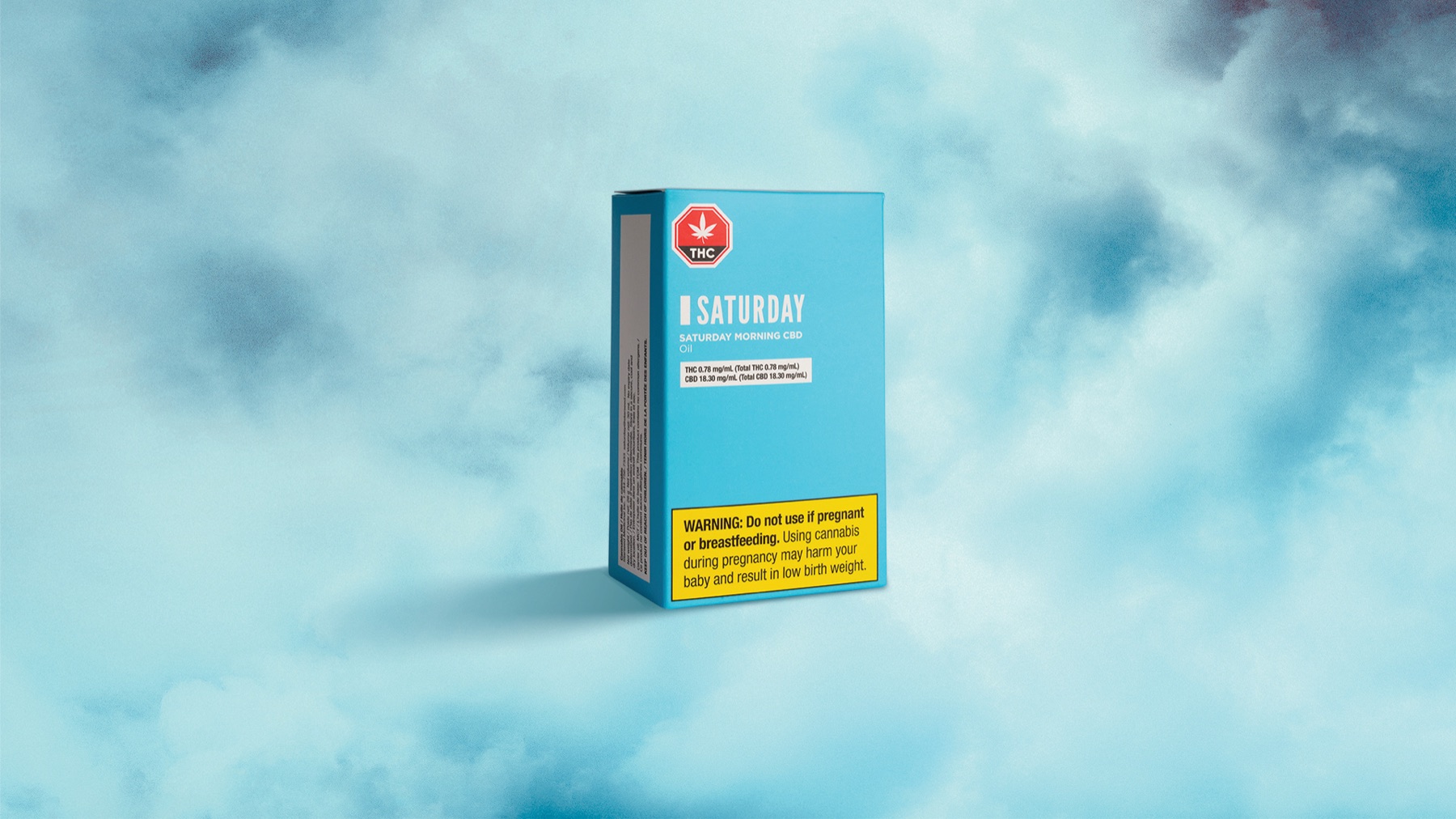
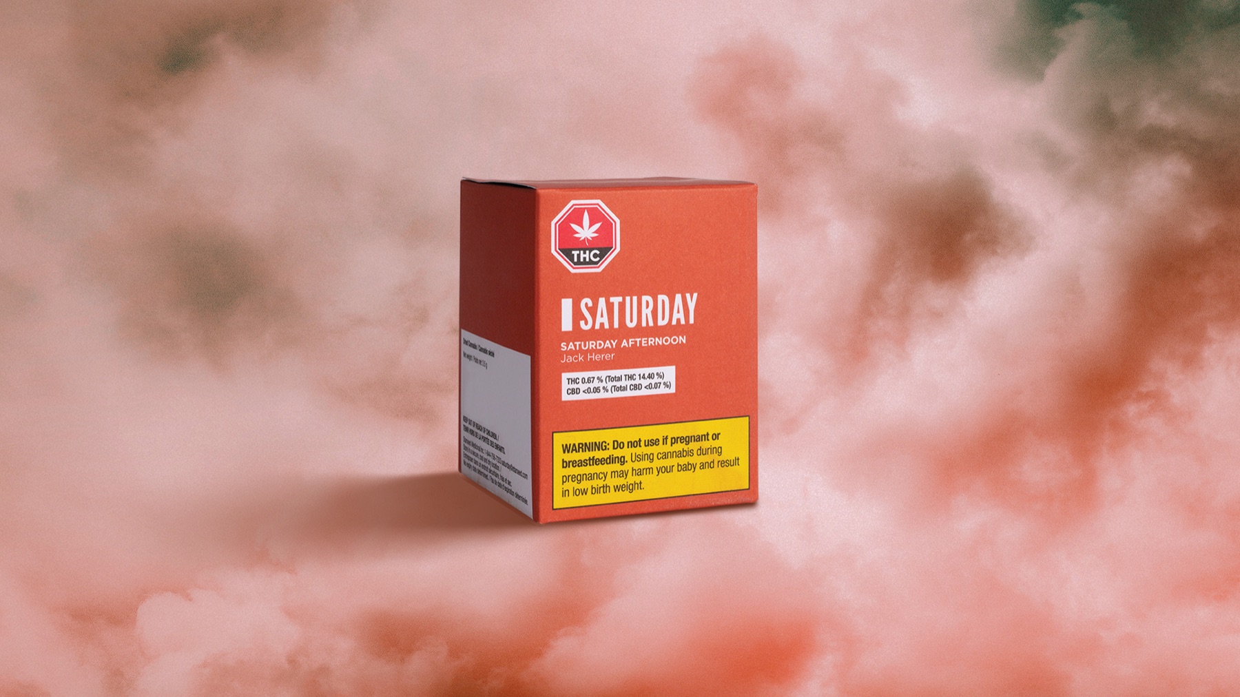
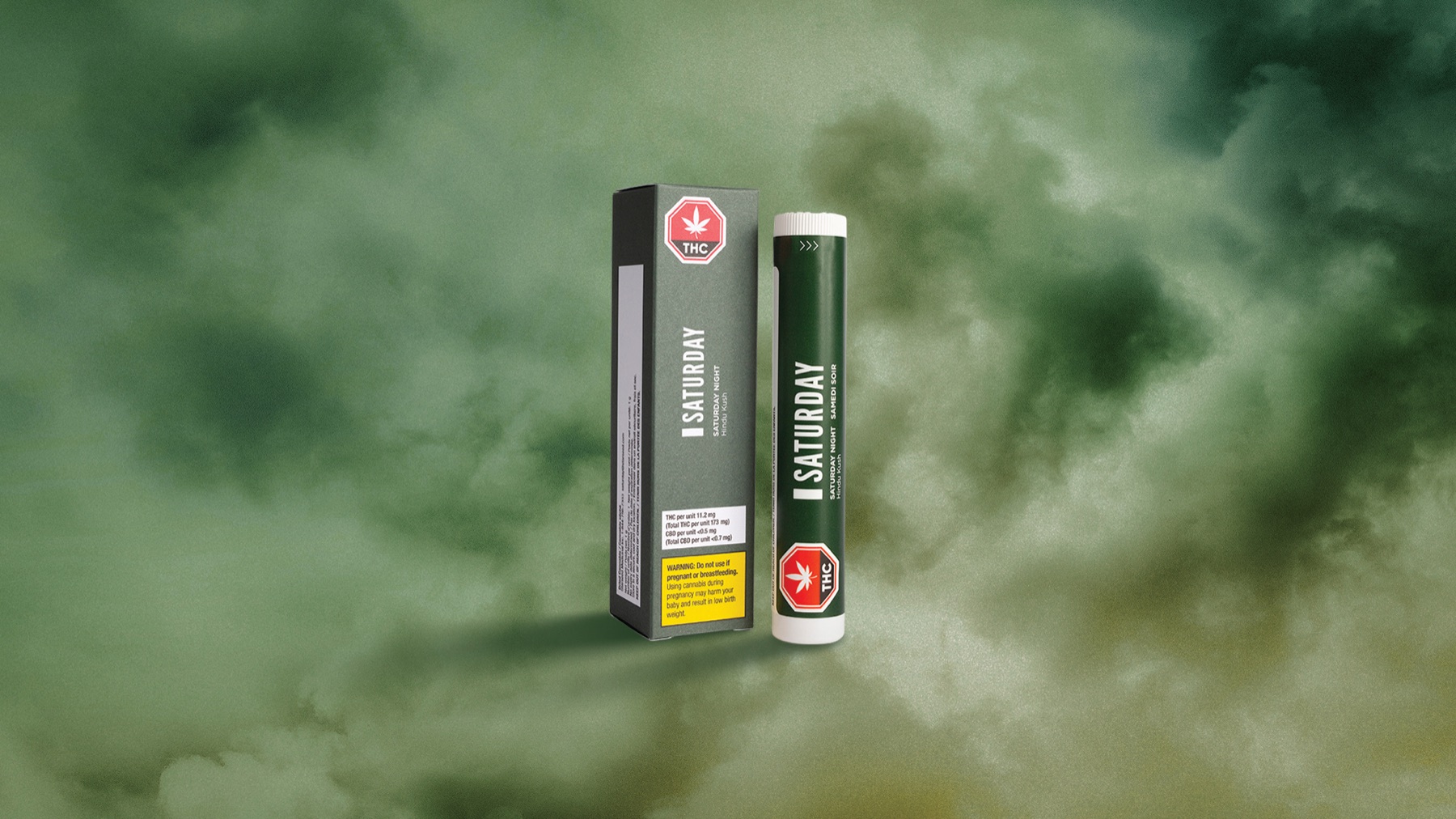
one idea, 166 ways.
The identity had to survive changing formats and regulations without losing the emotional promise. We built a packaging architecture, strain language and education system that could extend across flower, pre-rolls and vape products.

Clear hierarchy for mandatory information without flattening the personality.
Budtender and strain tools that carried the daypart logic to the counter.
Social, digital, retail and investor materials designed as one brand environment.
Brand strategy, naming, identity, packaging, retail, digital and launch by Smaller Agency.
Client: Saturday Cannabis.