lob.
Bocce felt niche, old and harder to explain than it should.
Turn the ritual into a playful social world.
Identity, illustration, digital and venue graphics.
A recognizable club experience from screen to court.
an old man's game, made impossible to resist.
Bocce has been played in parks for generations, usually by guys in flat caps who absolutely know you're holding the ball wrong.
Lob wanted the warmth, rituals and low-stakes rivalry, then added good food, wine and people with no idea what a pallino is.
"you can learn more about a person through an hour of play than through a lifetime of conversation."
— plato, patron saint of the brand
one red dot. a whole strange little world.
The identity had to work on court, on a menu and across a website. So we built a simple mark, a mint-and-red palette and a hand-drawn cast with excellent throwing form.
- brand identity — the lob. mark
- custom illustration system & animations
- website design
- venue & court graphics
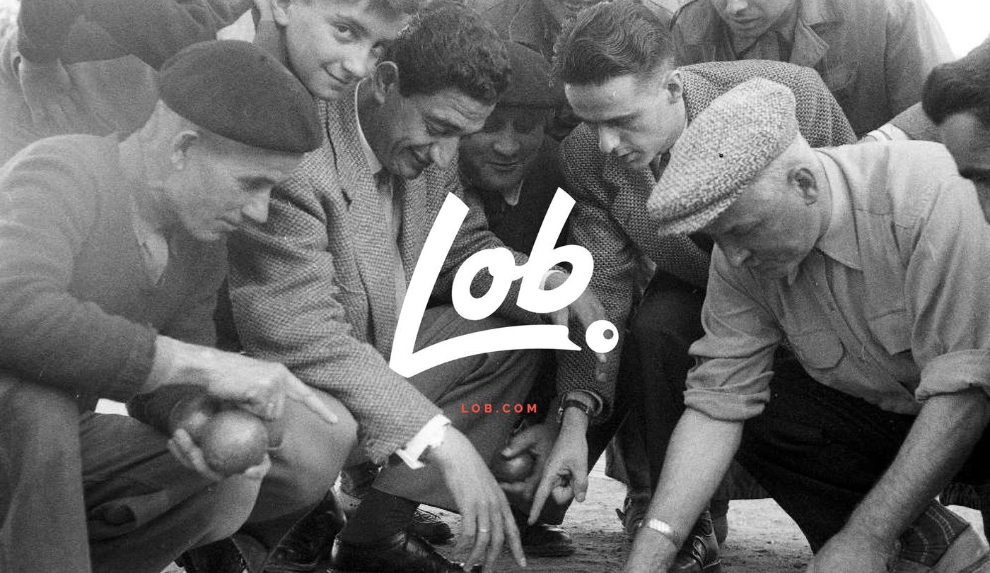
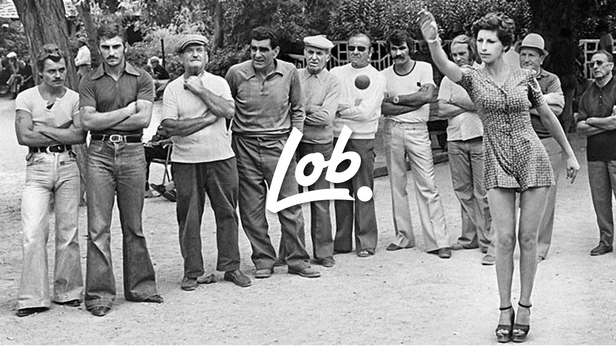
- brand photography — vintage bocce archive
drawn to play.
the mark
A hand-lettered lob. inside a red circle. Part club crest, part court marker, happy on a business card or painted six feet wide on the floor.
the illustrations
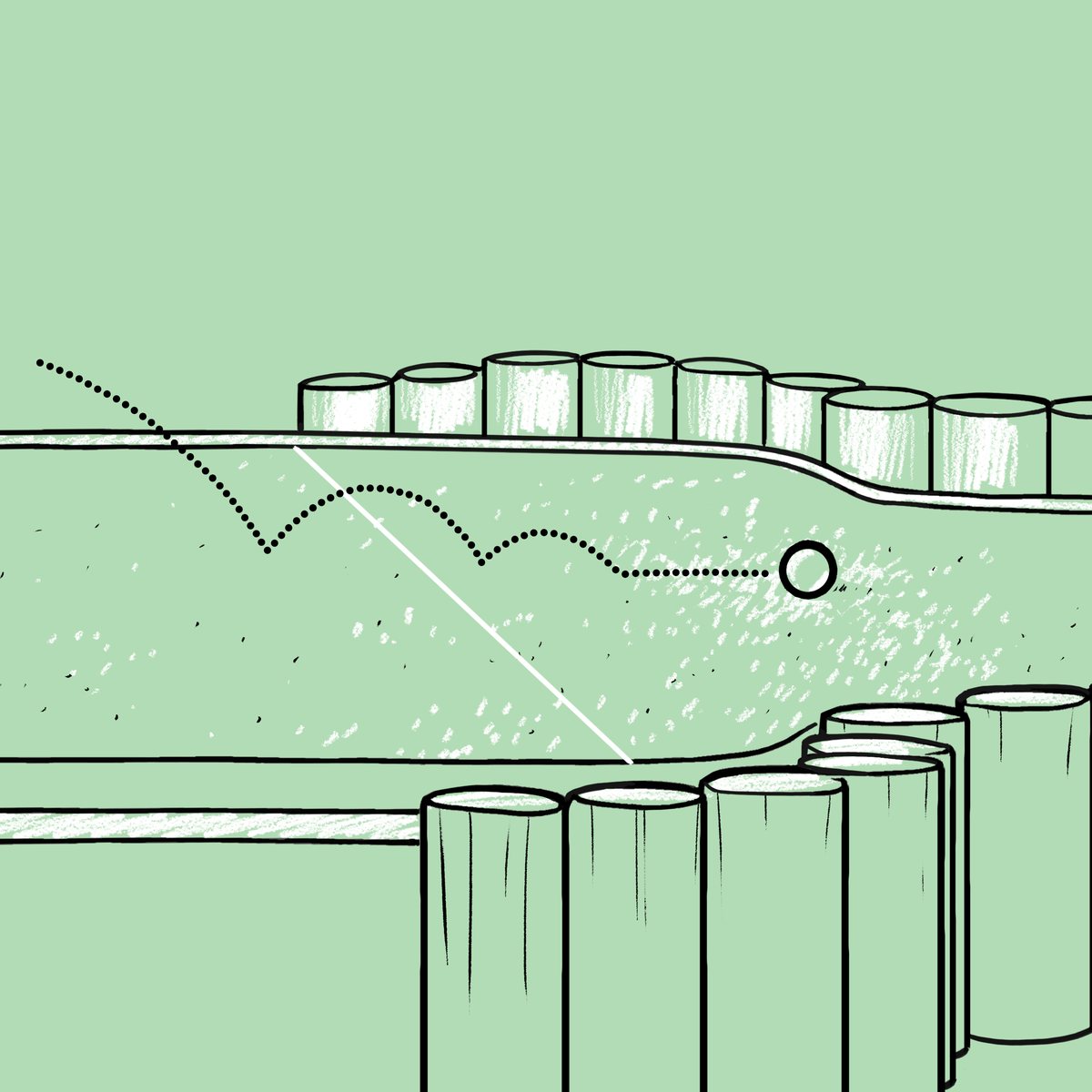
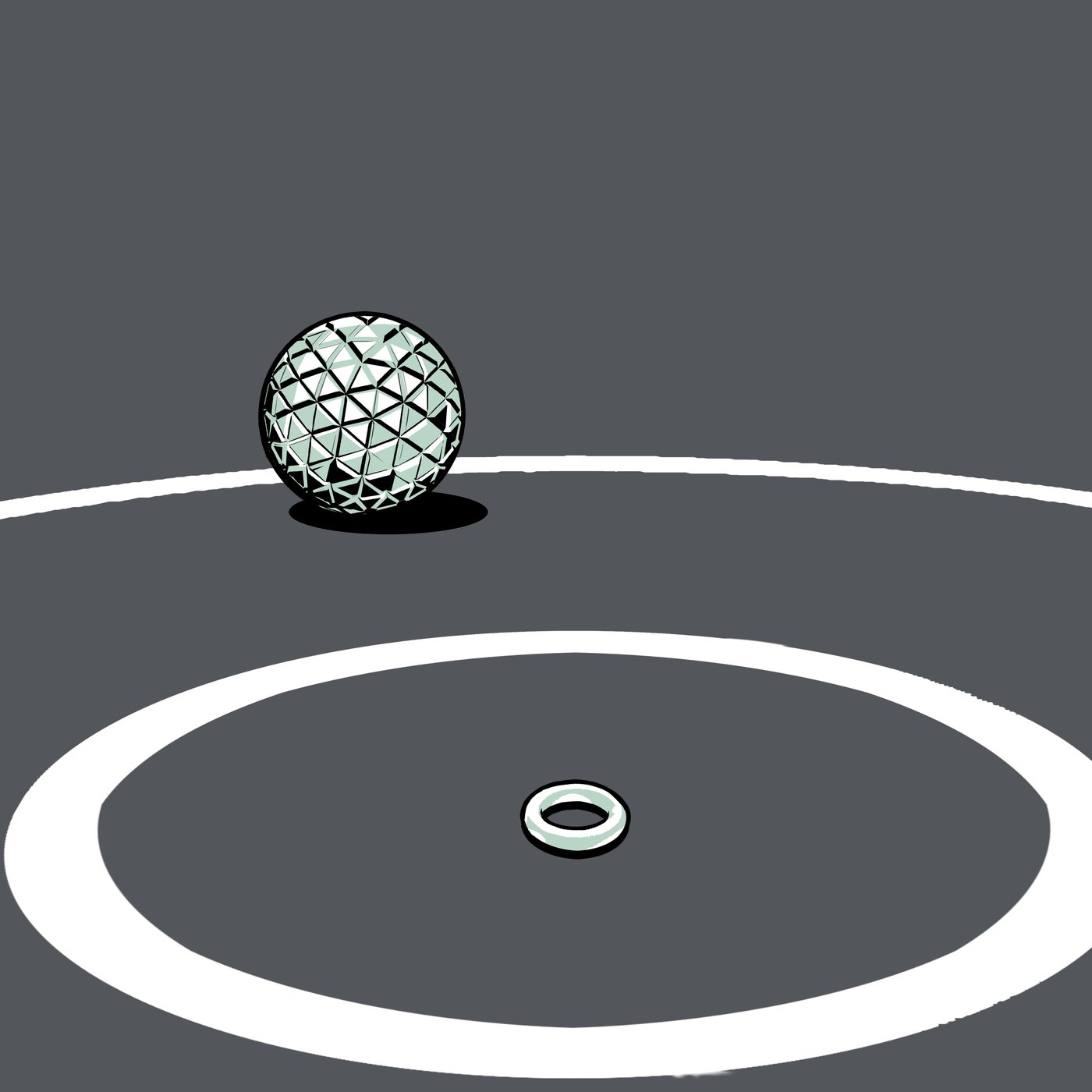
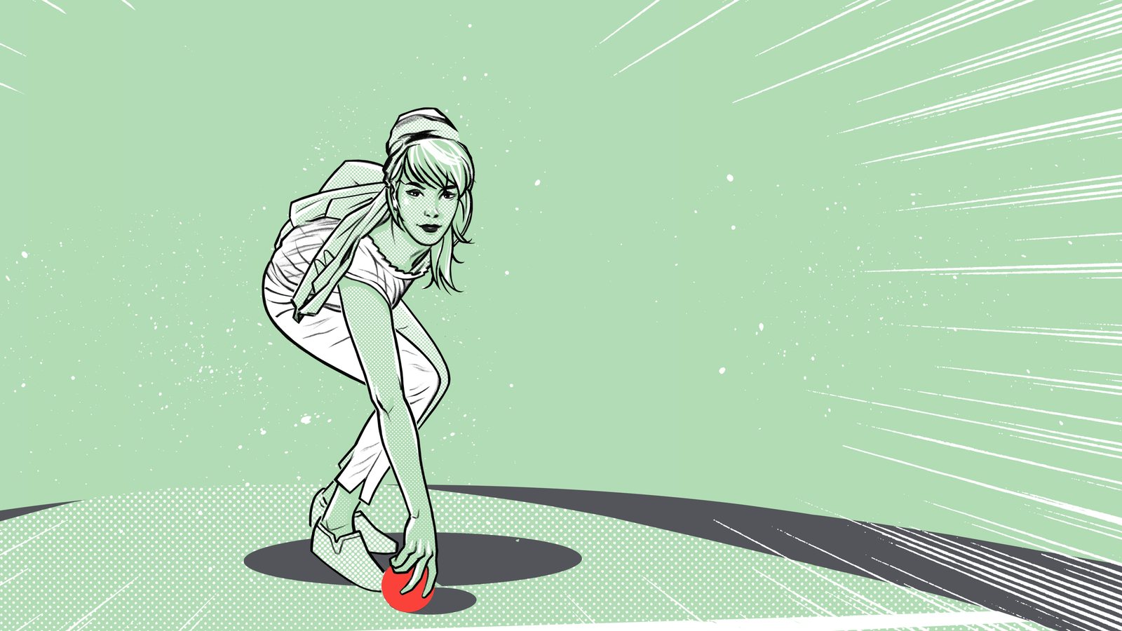
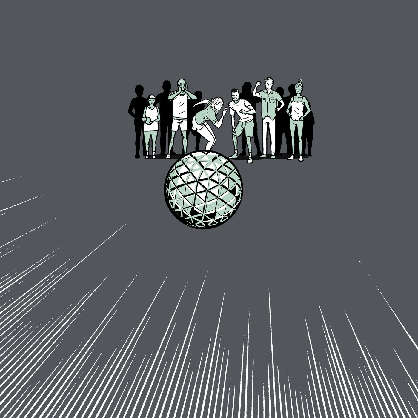
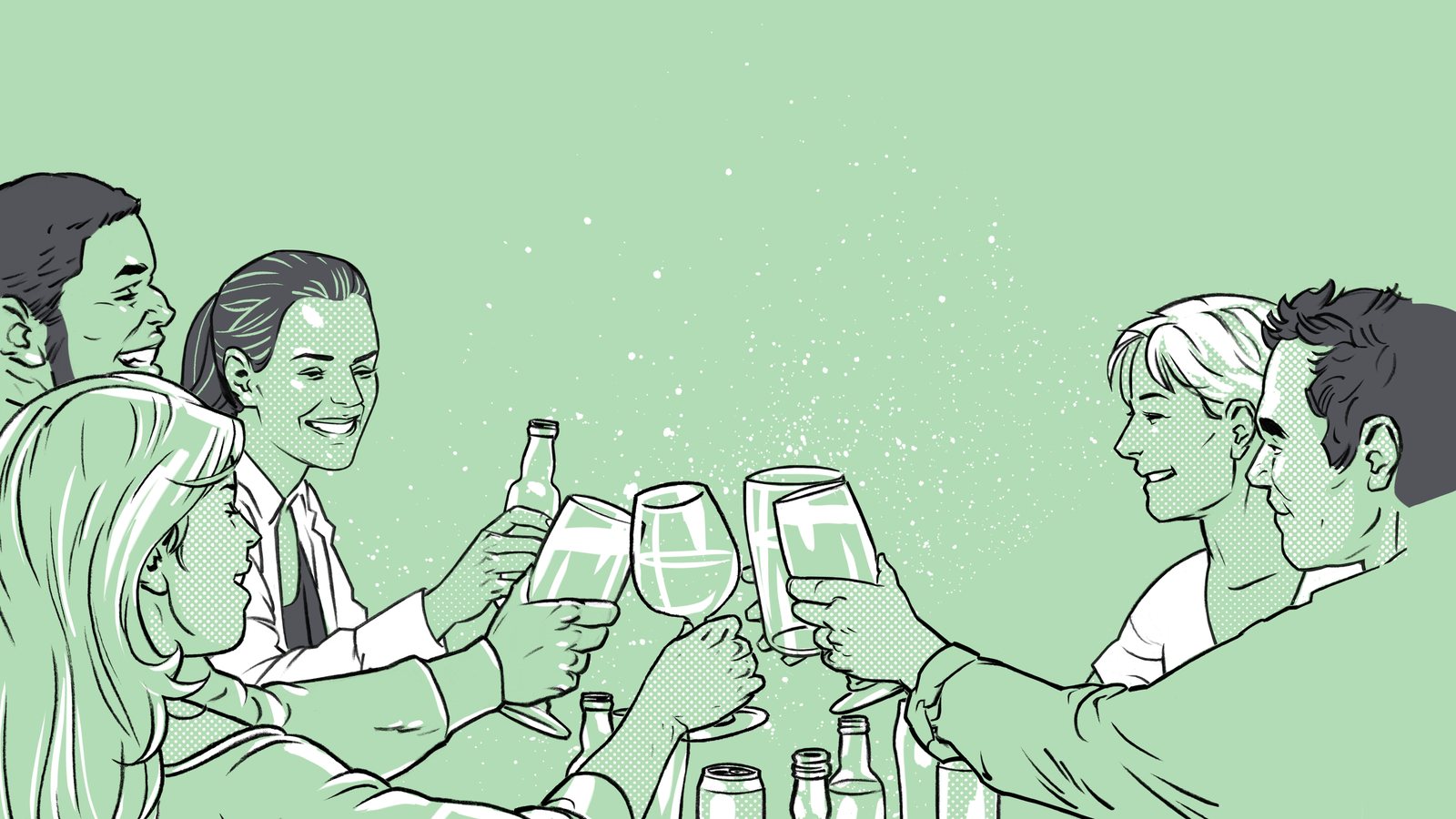
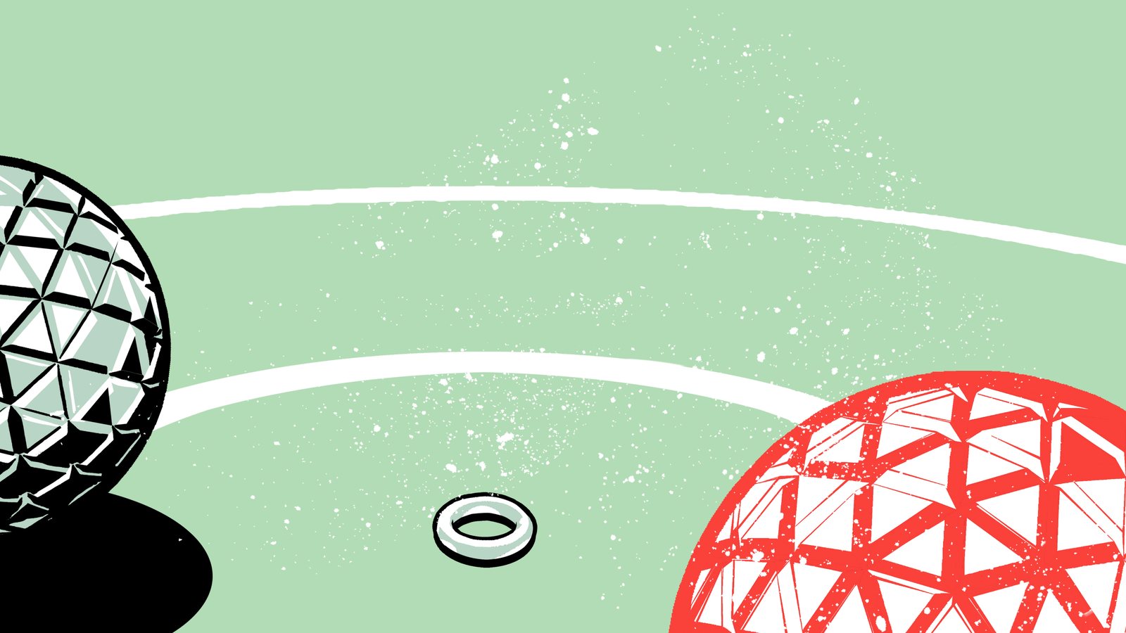
Players, spectators and geodesic bocce balls, all drawn in mint, ink and red. A few of them learned to move for the website.
the website
Every page got its own scene: home, food, about, even the privacy policy. Stock photography never made it through the door.
the venue
Court diagrams, floor logos and wayfinding turned the room itself into part of the identity.