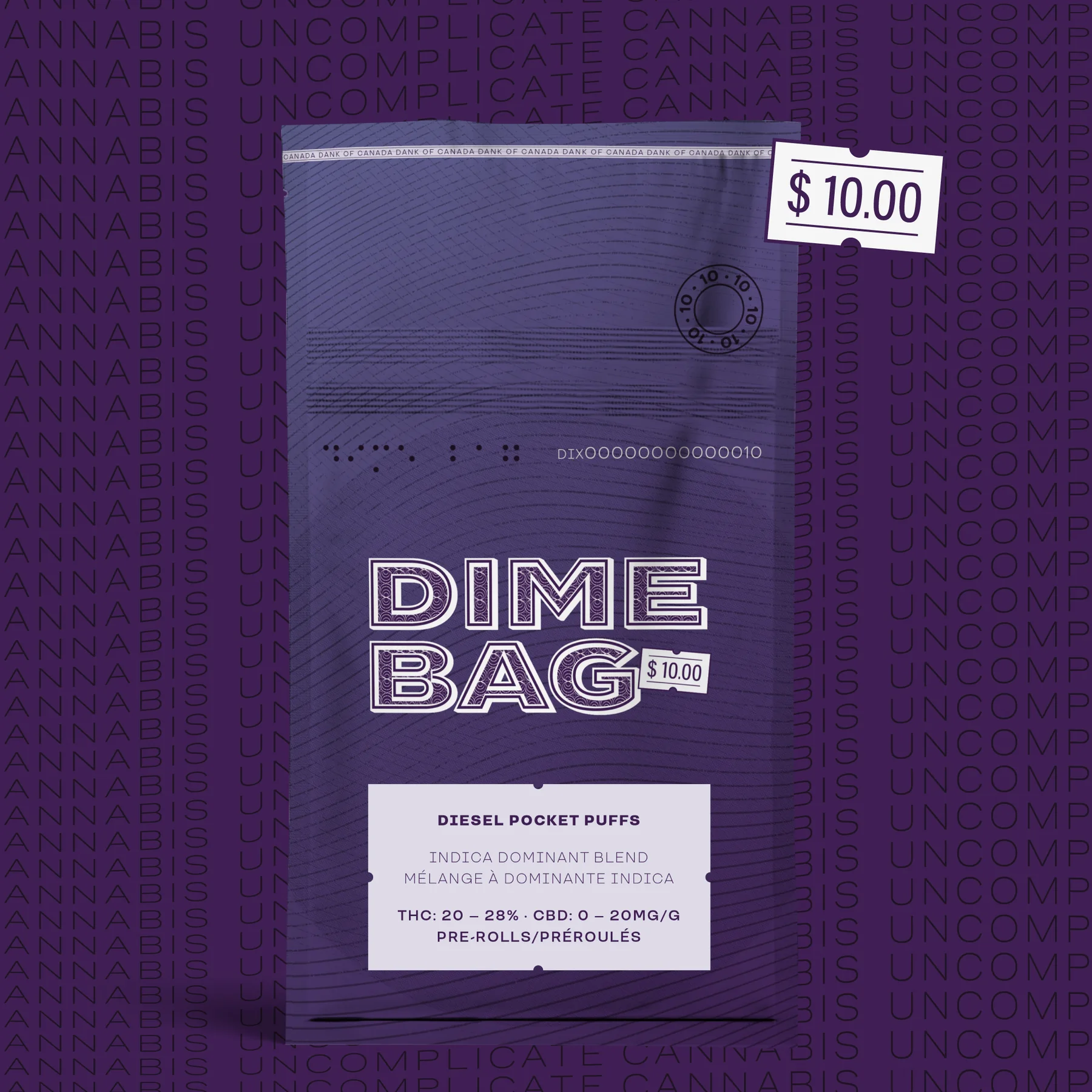
The problem
A wall of black tubs shouting the same way.

SUPA POWER / Brand + packaging
A wall of black tubs shouting the same way.
Make serious performance look less serious.
Sports nutrition had become one long black plastic wall. SUPA POWER wanted the credibility without borrowing the category scowl.
We weren’t designing another supplement label. We were building a brand athletes could notice, understand and want to keep around.
Aggression first. Product second.
Flavour first. Proof right behind it.
Give people something to want, then make the choice easy.
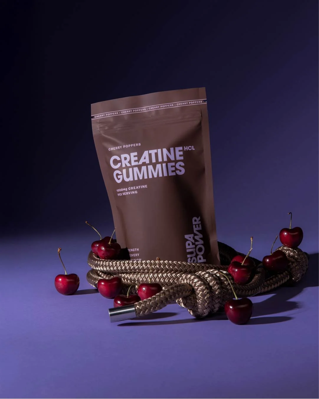
Call it what it should make you feel.
SUPA POWER is short, loud and useful. It works on a pouch, in a caption and yelled across a gym. More importantly, it gave the whole brand a rule: serious performance does not have to dress like punishment.
Easy to remember. Hard to mumble.
Straight talk. No supplement theatre.
Performance can have an appetite.
One family. No black-plastic camouflage.
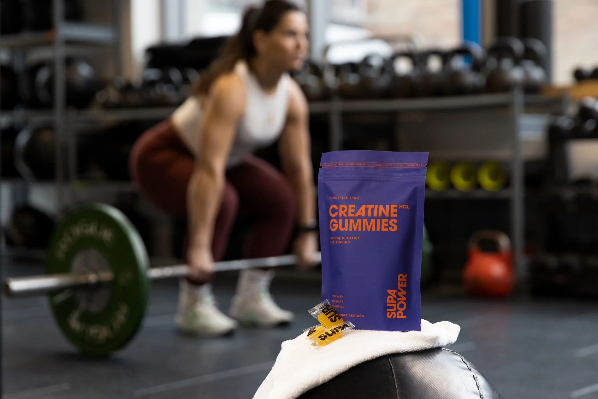
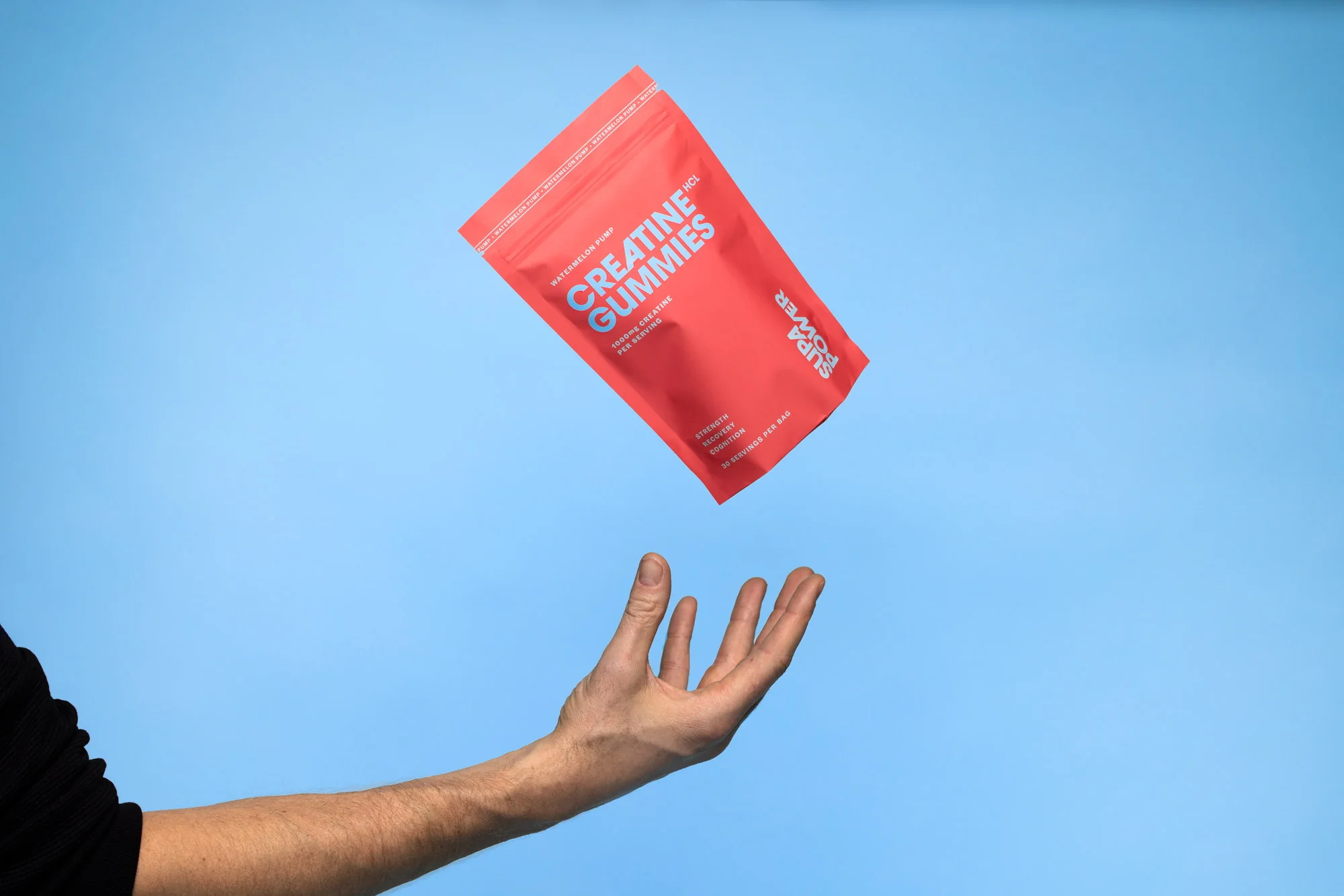
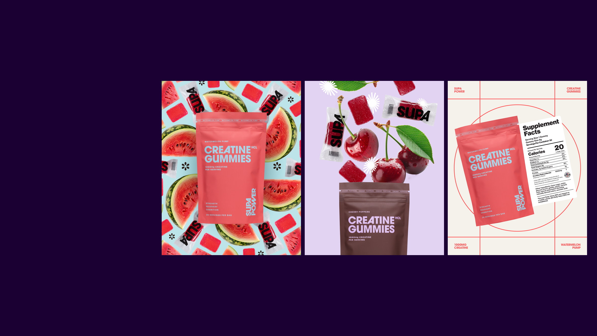
The packaging leads with product and flavour, then keeps the proof easy to find. Each SKU gets a distinct face without wandering away from the family.
Product, flavour and benefit do not fight for the same inch.
Colour changes the mood. Structure keeps the family together.
Claims and Nutrition Facts are hierarchy—not debris.

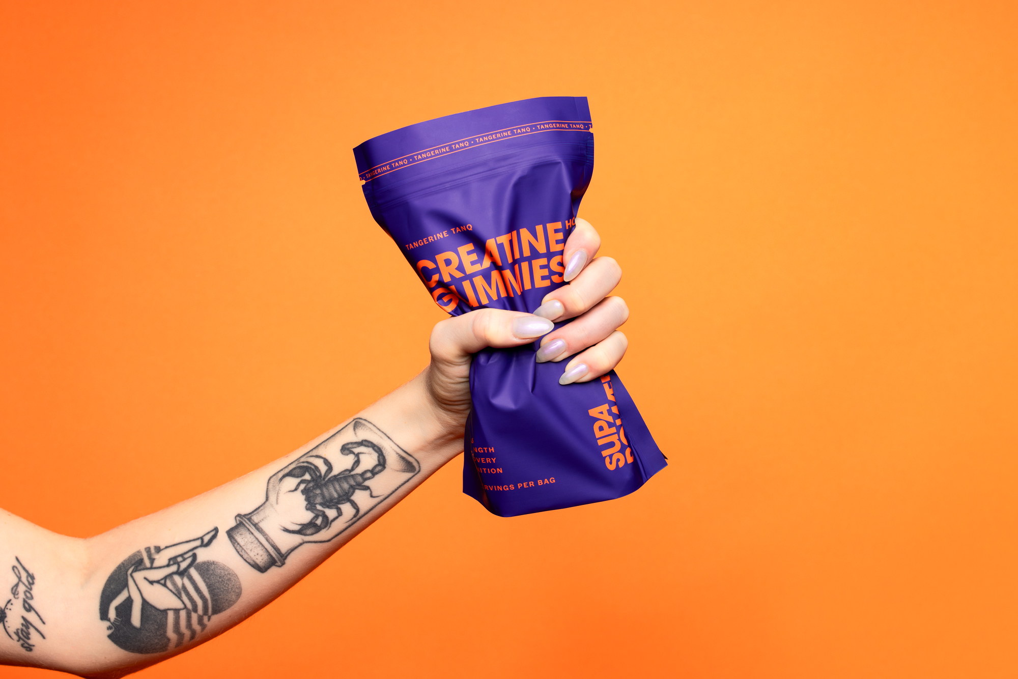
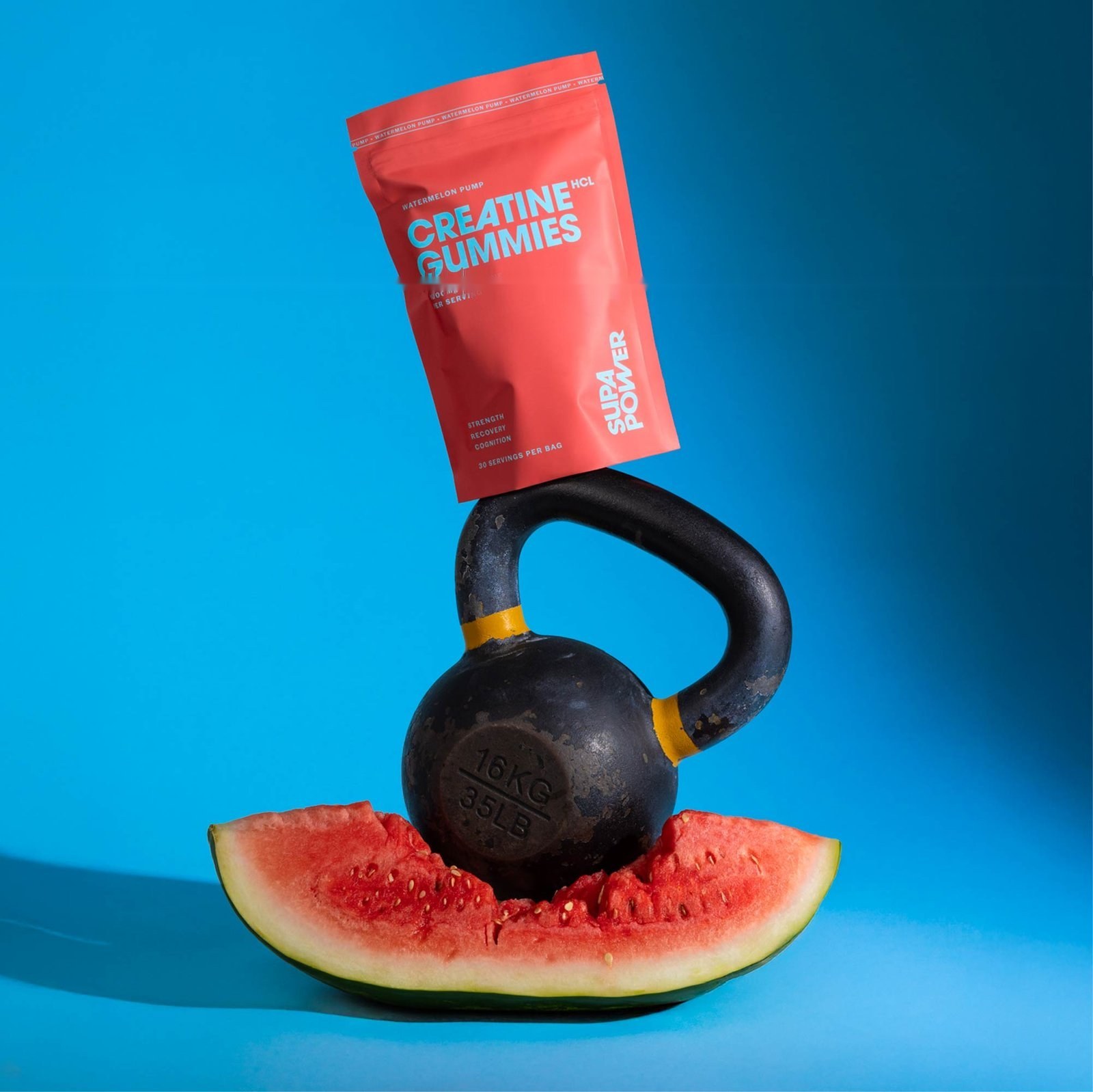
Make the pack worth photographing.
Fruit, iron and just enough controlled chaos turned each flavour into a small performance world. The system had enough range to keep the next image from feeling like the last one.