The problem
A regulated shelf full of brands saying too much.
Dime Bag / Brand + packaging
Ten bucks. No detective work.
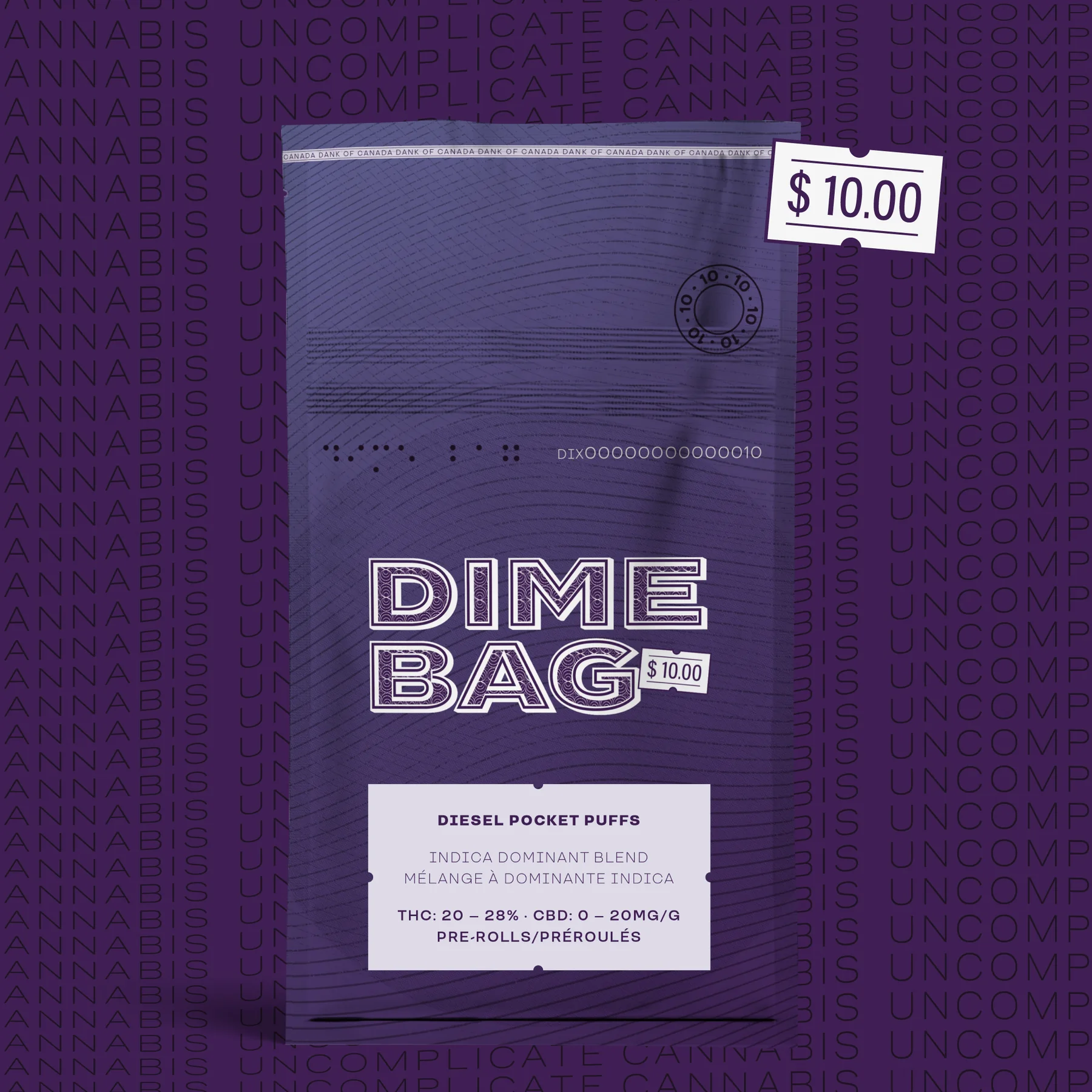
Make value feel like a choice, not a compromise.
Canadian cannabis packaging comes with a long list of rules and very little room to move. Most brands responded by cramming the remaining space with noise.
Dime Bag had a much better starting point: every product was $10. The job was to make that promise instantly clear, then build enough personality around it to become a brand people looked for.
Small, regulated and easy to overwork.
Every product. Ten dollars.
Affordable without looking disposable.

The price wasn’t a promotion. It was the brand.
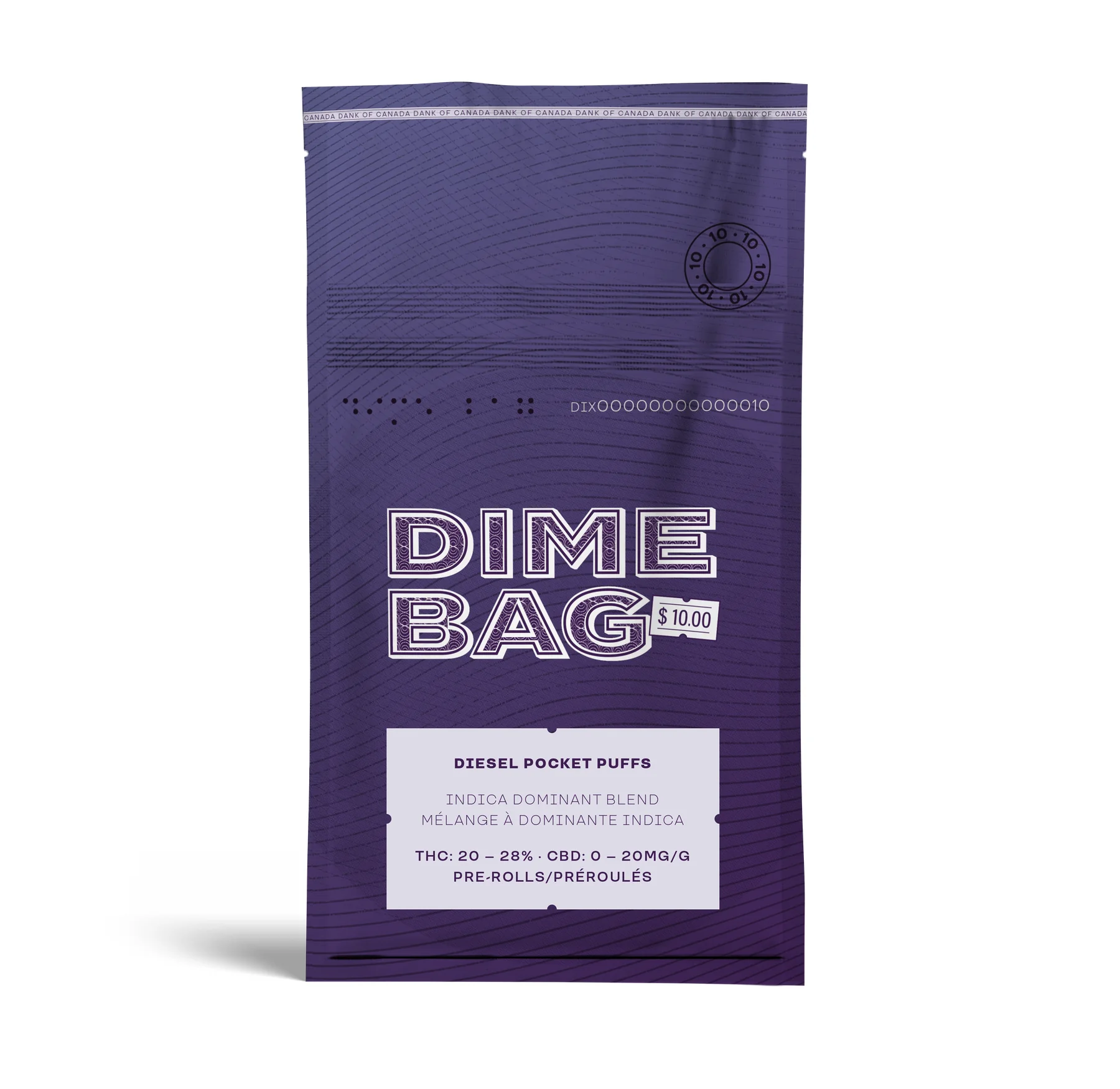
We built Dime Bag on value and clarity. No inflated lifestyle promise. No decoding the offer. The name, the price and the pack all answered the same question at the same time.
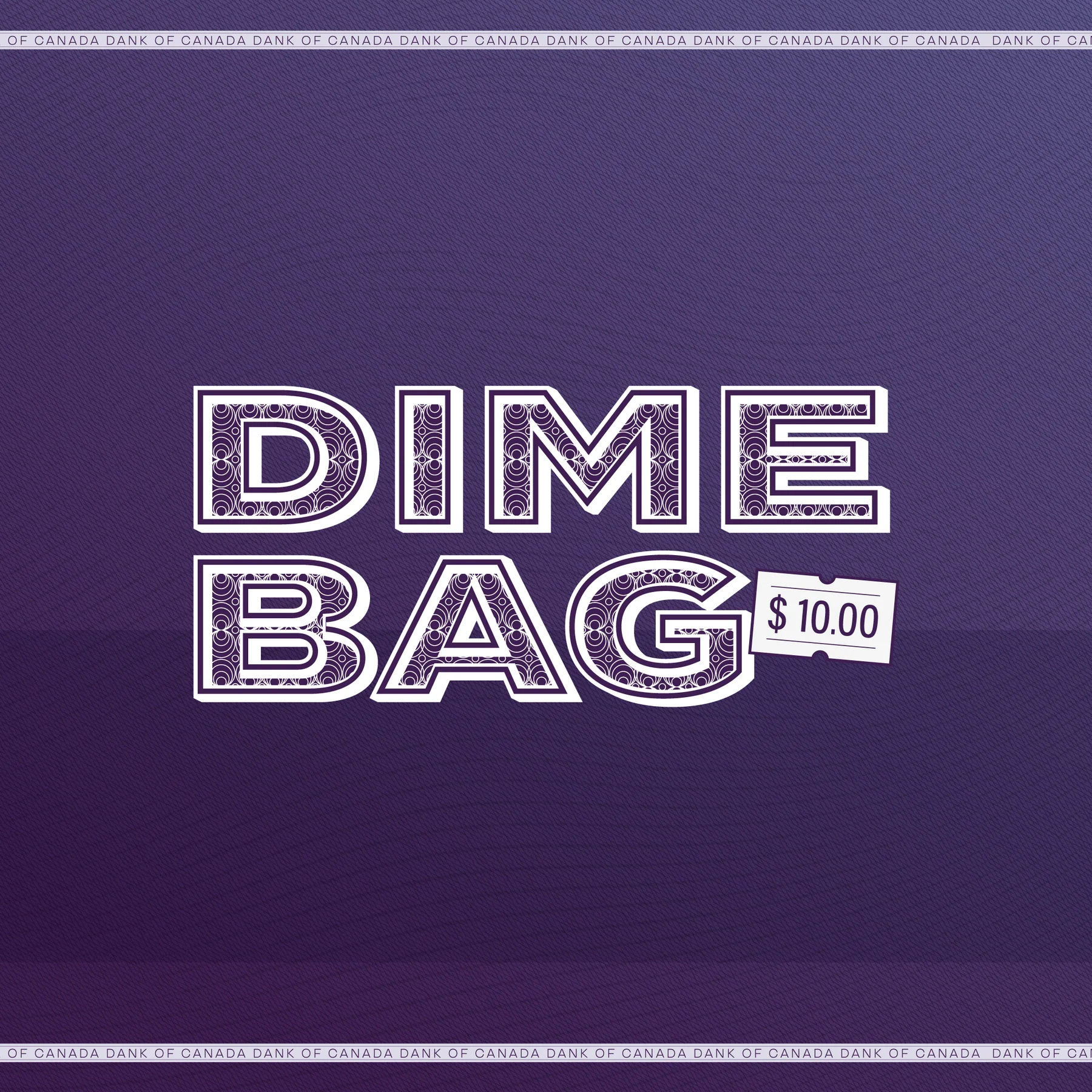
Dime Bag already carries the price in the name.
The ticket makes the shelf decision immediate.
Good product, clear value, no theatre.
A ten-dollar bill became the design brief.
The purple palette and engraved linework borrow the visual logic of Canadian currency. Serial-number details, fine patterns and the price ticket turned a compliance-heavy pouch into something ownable.
The system could hold the legal copy, product information and bilingual requirements without losing the one thing someone needed to understand first.
Currency cues make value visible before it is read.
Price, product and compliance each get a clear job.
The system carries strains, formats and future drops.

Once the idea was right, the rest came easily.
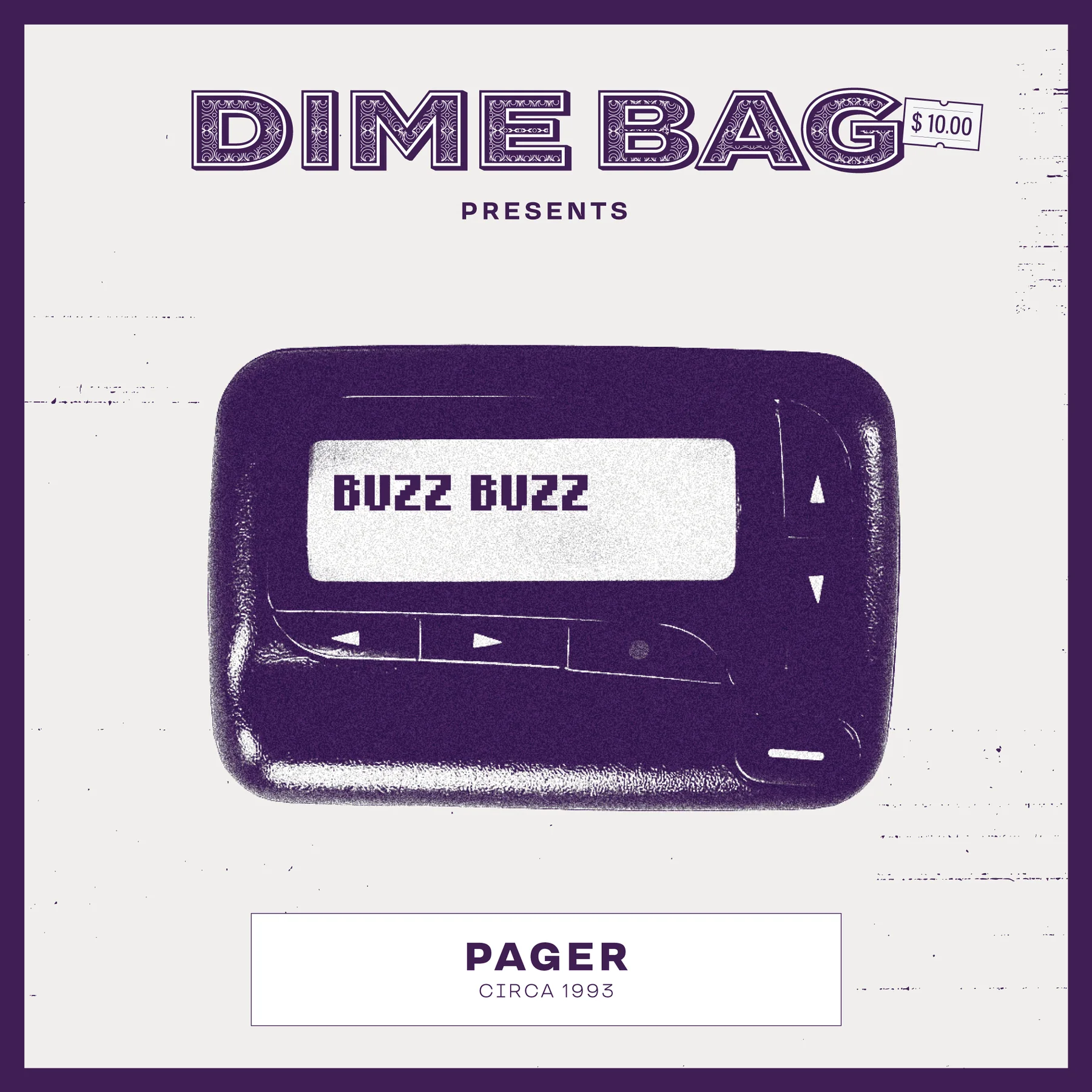
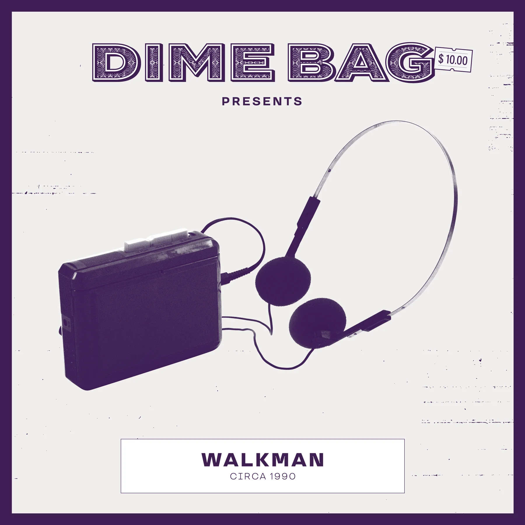
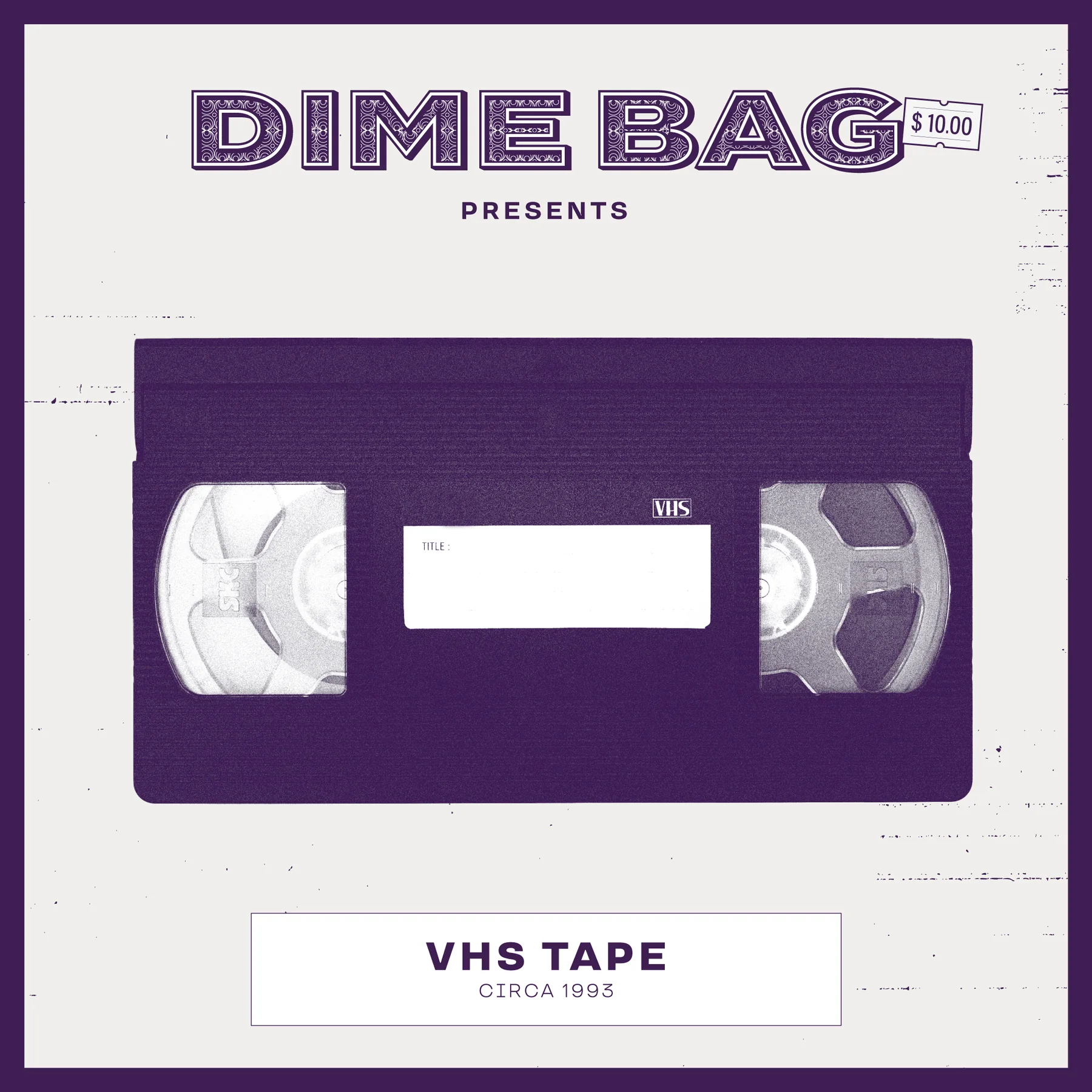
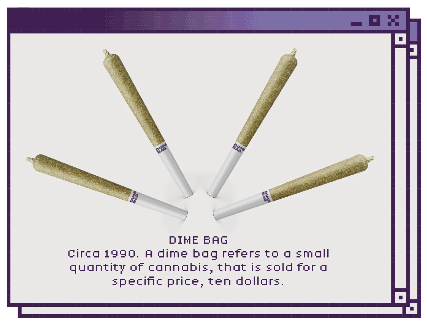
Pagers, Walkmans, VHS tapes and pixel graphics gave the brand a throwback world that felt coherent rather than costume-y. Packaging, social, digital and retail all came from the same simple promise.