three bottles. one estate.
Distinct packaging stories for Red Cask whisky, Butter Pecan cream liqueur and Ice Storm vodka—each with its own reason to be picked up.
A broad spirits portfolio needs difference without disconnection.
Give each liquid a focused visual story inside the estate world.
Packaging design across whisky, cream liqueur and vodka.
Clear shelf character with a shared Canadian provenance.
a famous name is not a packaging system.
Wayne Gretzky Estates spans different liquids, occasions and audiences. The portfolio needed the authority of the master name without forcing every product into the same visual costume.
Our role was to make each expression legible and desirable on its own terms while preserving enough family resemblance to feel like one estate.
The estate must remain visible as products move from whisky to liqueur to vodka.
Each liquid needs its own cues, appetite and occasion at shelf distance.
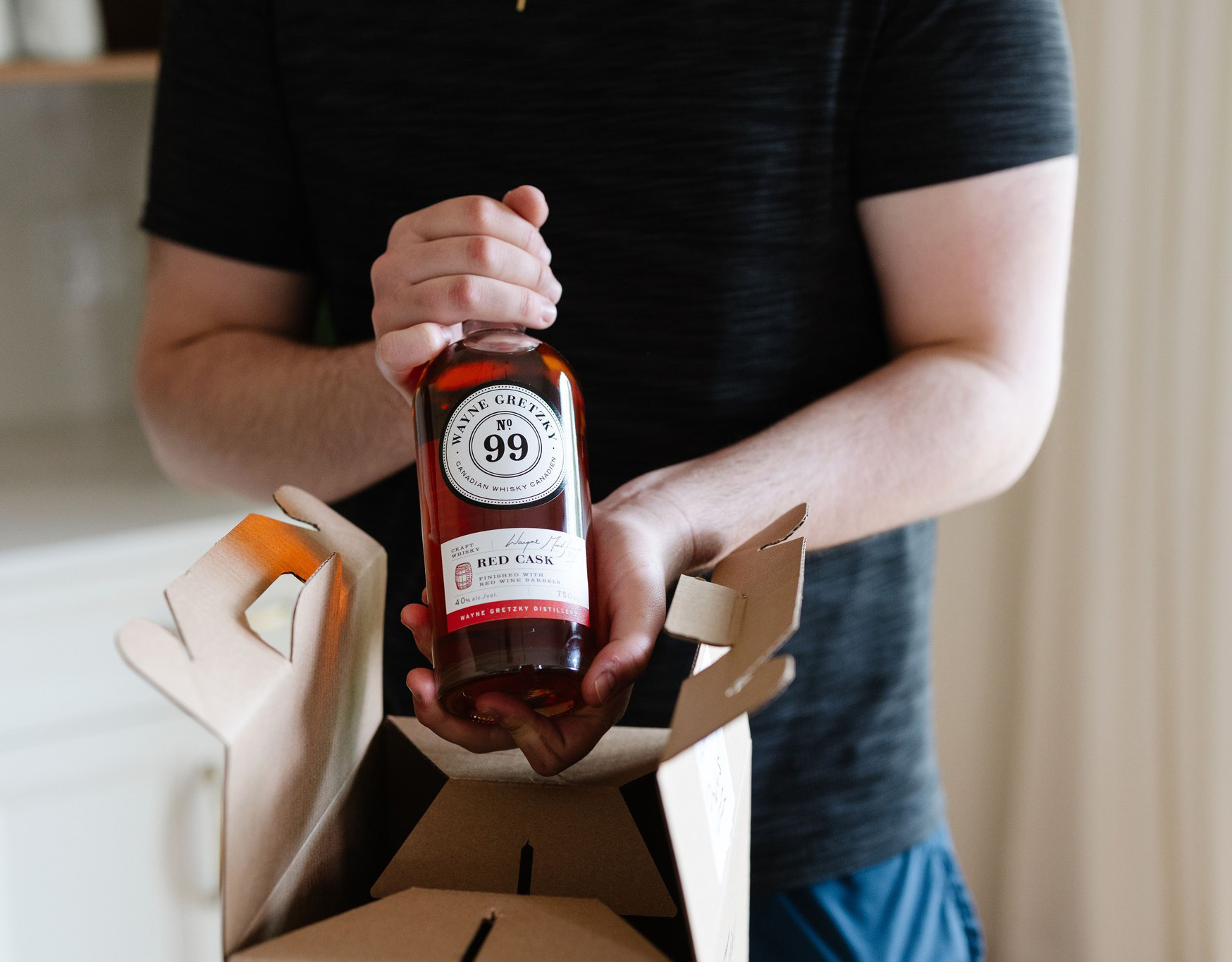
Warm red, barrel language and confident hierarchy cue the whisky's finish.
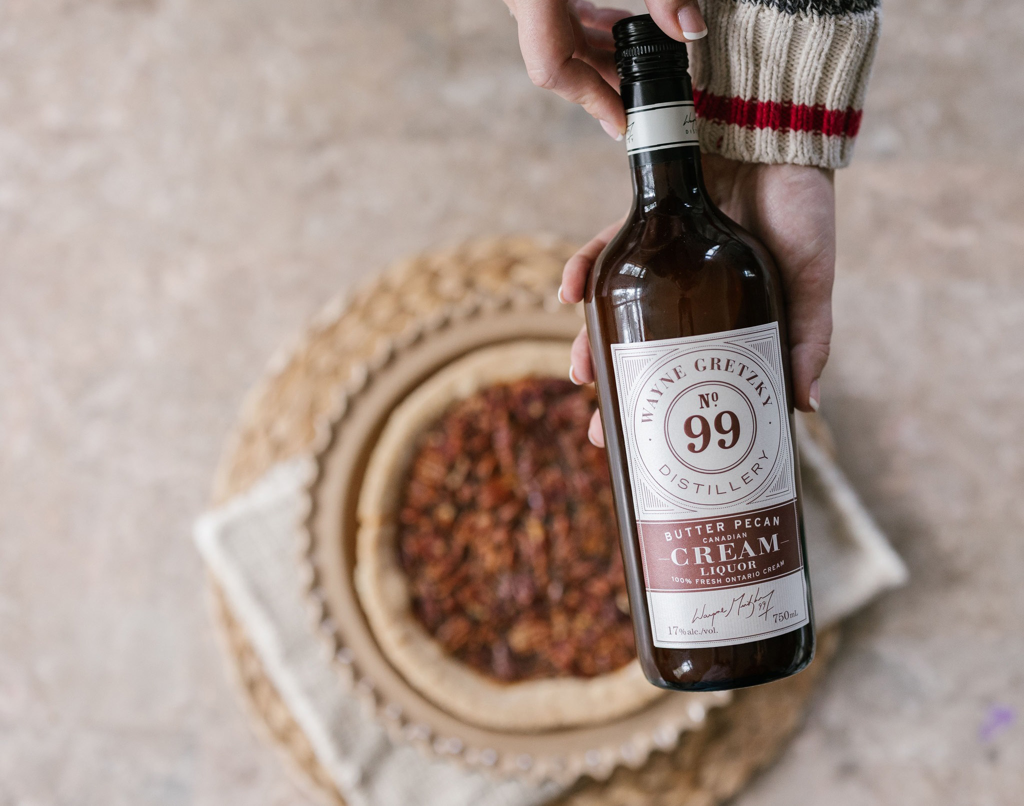
A lighter, appetite-led expression for a creamy, flavour-forward product.
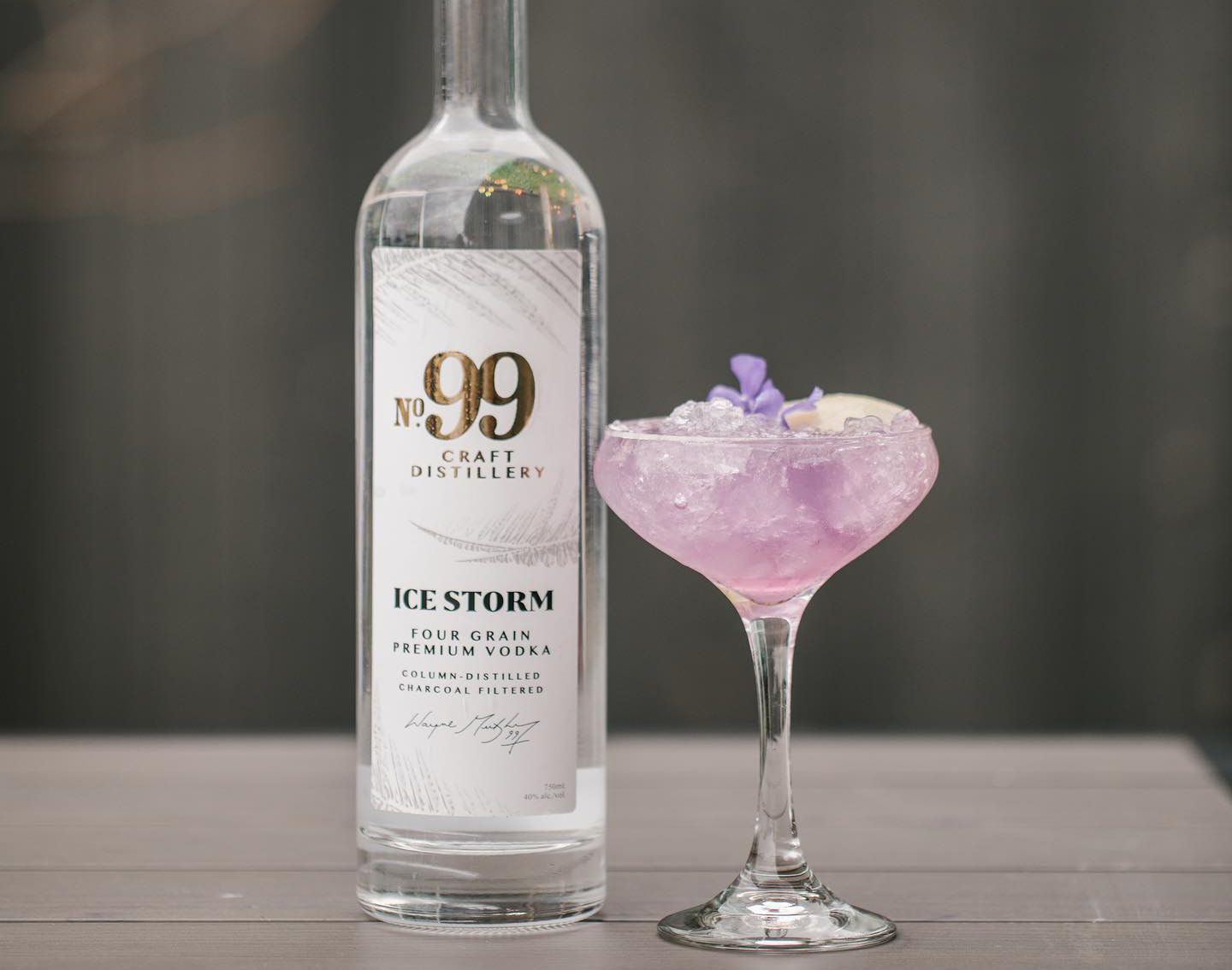
An icy visual world and cleaner cues give vodka a distinct presence.
family resemblance, without family uniforms.