New Standard
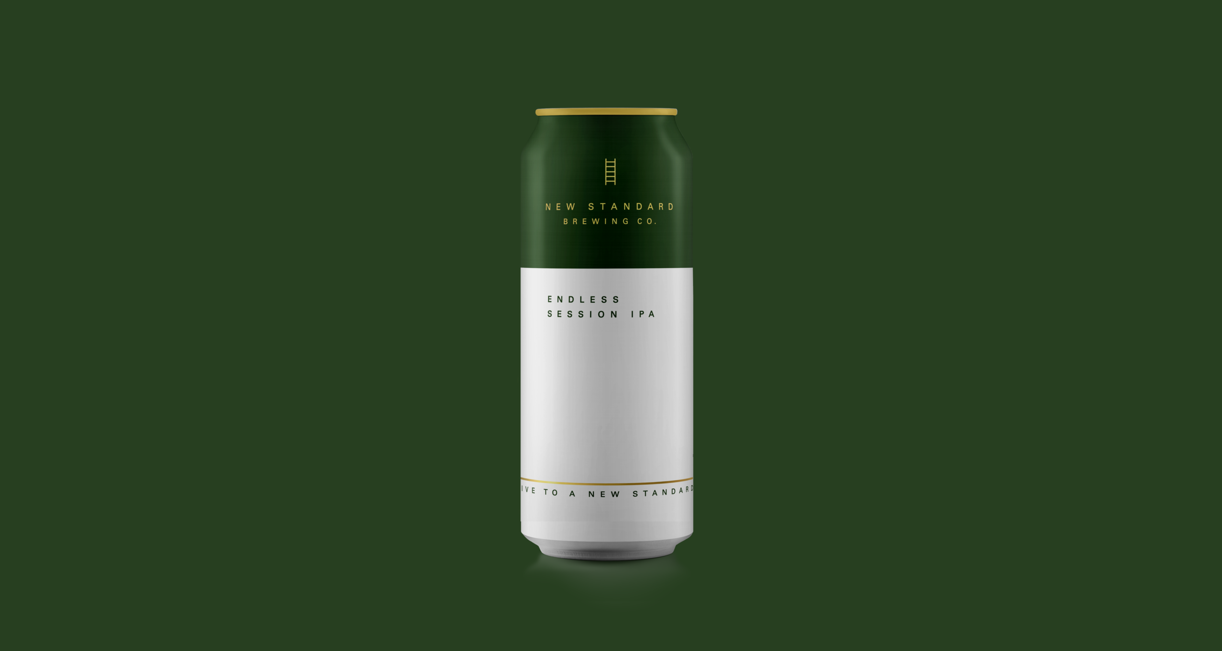
New Standard approached us to help build their brand… we looked at their package first and shopped the category. After finding that it didn’t stand out in the craft beer aisle and the messaging hierarchy was off, we set to work to redesign the brand and package to better communicate at shelf and stand out against the competition.
Strong colour blocking, simple clean design language (in a rather cluttered looking category), and clear communications around the product benefits (low cal, organic, premium) all work together to help New Standard do more with less. Cleaner typeface and a brand icon -the ladder- will ultimately become an integrated part of the design language, helping the brand to “ladder” up to a premium light beer that delivers and sets a “new standard” for beer.
WE WORKED ON
Brand Development
Brand Launch
Package Design
Product Launch
Beer
ORIGINAL

OUR REBRAND


see other projects