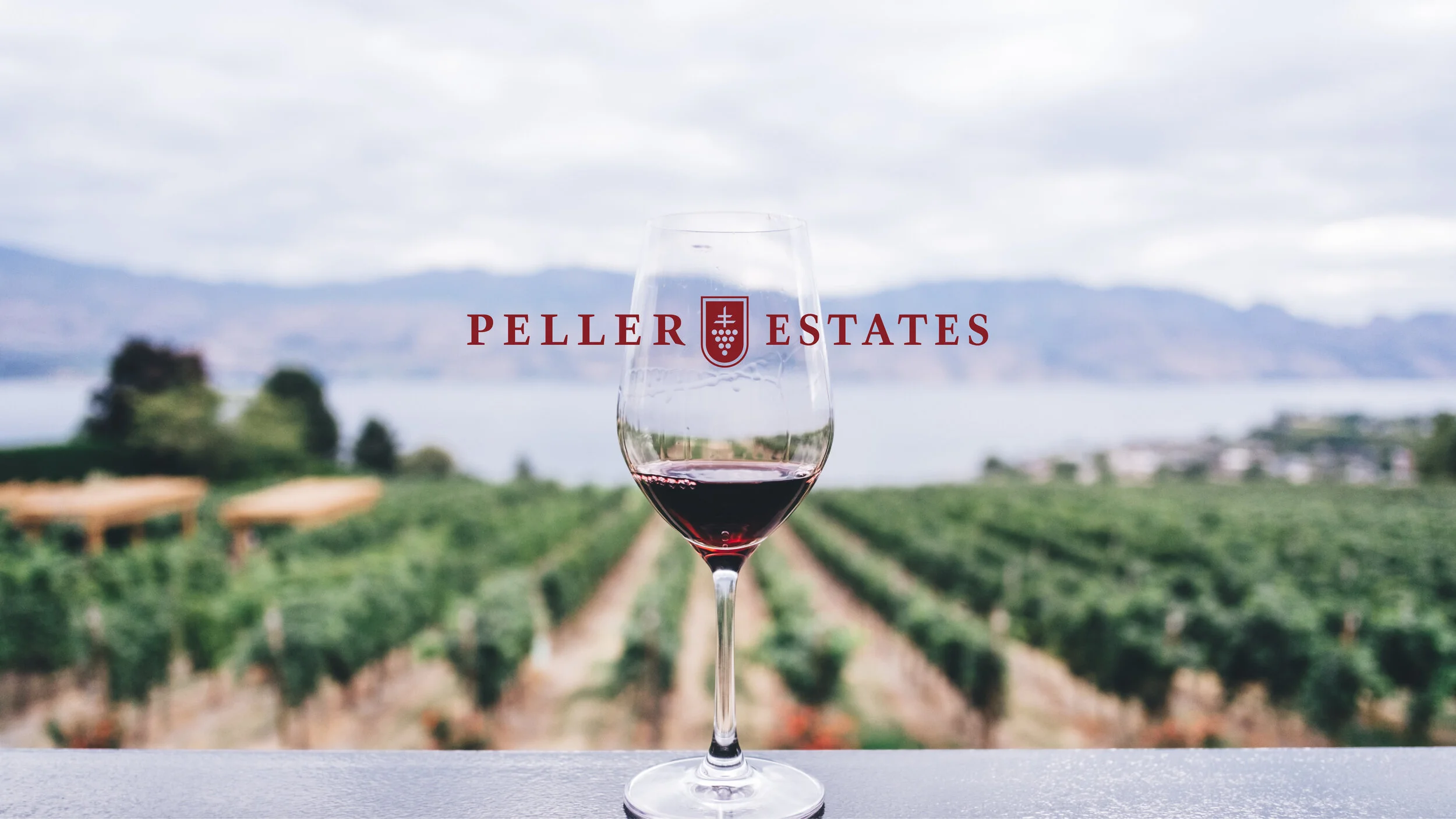
Peller Estates
Reinventing a staple and the largest volume wine brand in Canada was no easy task.
Peller Estates is based on the concept of social gathering. We identified the brand's core values and tone of voice (crowd-pleasing, tradition, passionate, clean and inviting) and further develop a timeless package design for their wine. Reminiscent of a timeline or film reel the layout evokes a sense of 'events unfolding'.
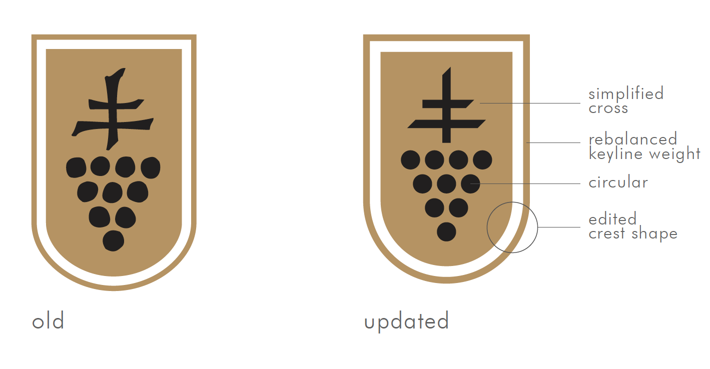
The updated crest modernizes the geometry through simplification. The changes are subtle, maintaining brand continuity while allowing greater flexibility for integrating the wordmark into a wider range of graphic styles, as well as creating an opportunity for extending the design language to other brand assets (ie: circular frames, parallel bars that mirror the updated cross form etc).
WE WORKED ON
Brand Development
Package Design


see other projects