Why most AI-generated packaging cannot go to print
The image can look finished before any of the hard packaging decisions have been made. Here is the gap between a generated mockup and a file that can ship.
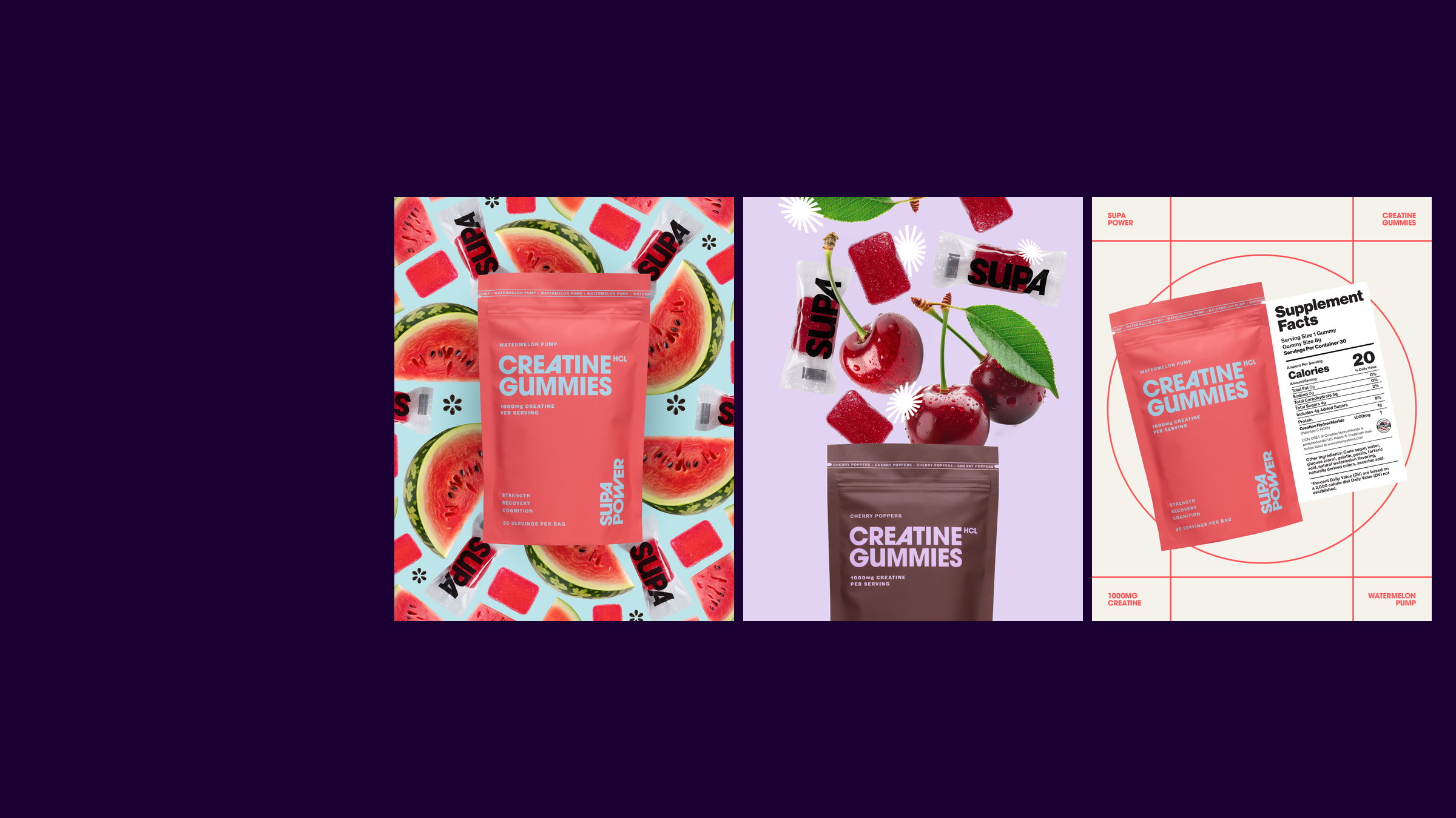
AI can make a convincing picture of a package. It cannot reliably make the packaging file. A real pack has to fit a dieline, hold mandatory information, work across a range, separate correctly for print and survive the handoff to the people making it.
A mockup is not a package.
This is the part getting lost in the AI conversation. The image can look finished long before any of the difficult decisions have been made.
The pouch sits perfectly. The foil catches the light. The callout is centred. Then somebody asks for the back panel, the French, the barcode, the Nutrition Facts table and the other nine flavours.
That is usually where the magic trick ends.
The prompt can make the picture. It does not make the system.
Six things the prompt did not solve
The dieline. Seams, folds, seals, curves and tolerances change where the design can actually live.
The hierarchy. Brand, product, flavour, benefit and proof still need an order. Making everything larger is not an order.
The range. One image may look great. A system has to survive the longest flavour name, smallest format and fifteenth SKU.
The required information. Ingredients, allergens, claims, net quantity and prescribed panels need real space.
The print behaviour. Spot colours, process colour, white ink, foil, varnish and substrate all change the final result.
The handoff. Somebody still has to build clean artwork, check the files and answer the printer's questions.
The Nutrition Facts panel is not a texture.
AI images often turn regulated information into believable-looking noise. That may pass in a thumbnail. It does not pass on a Canadian food package.
The Canadian Food Inspection Agency prescribes the content, format and presentation of Nutrition Facts tables. Its checklist gets specific about type, size, leading, contrast and placement. The English and French information also has to be handled properly. This is not the area for a generated approximation.
The barcode wants some peace and quiet.
Barcodes are another favourite casualty. GS1 Canada's guidance calls for clear quiet zones around the symbol and warns against truncation. In normal language: stop running copy, folds, glue areas and graphics into the space the scanner needs.
The callouts do not balance themselves.
Protein. Flavour. Servings. Sugar. New. Improved. Three claims from legal and another two from sales. A package can become a meeting transcript very quickly.
Good hierarchy is not about fitting every request. It is about deciding which message earns the first look, which one supports it and what can wait until the pack is in somebody's hand.
AI is still useful. Just earlier.
We use it for visual exploration, rough references, unexpected compositions and getting past the first obvious idea. It can make the early part faster and stranger in a good way.
Then the design work starts: choosing, editing, building the system, applying it to real copy and making files that can survive production.
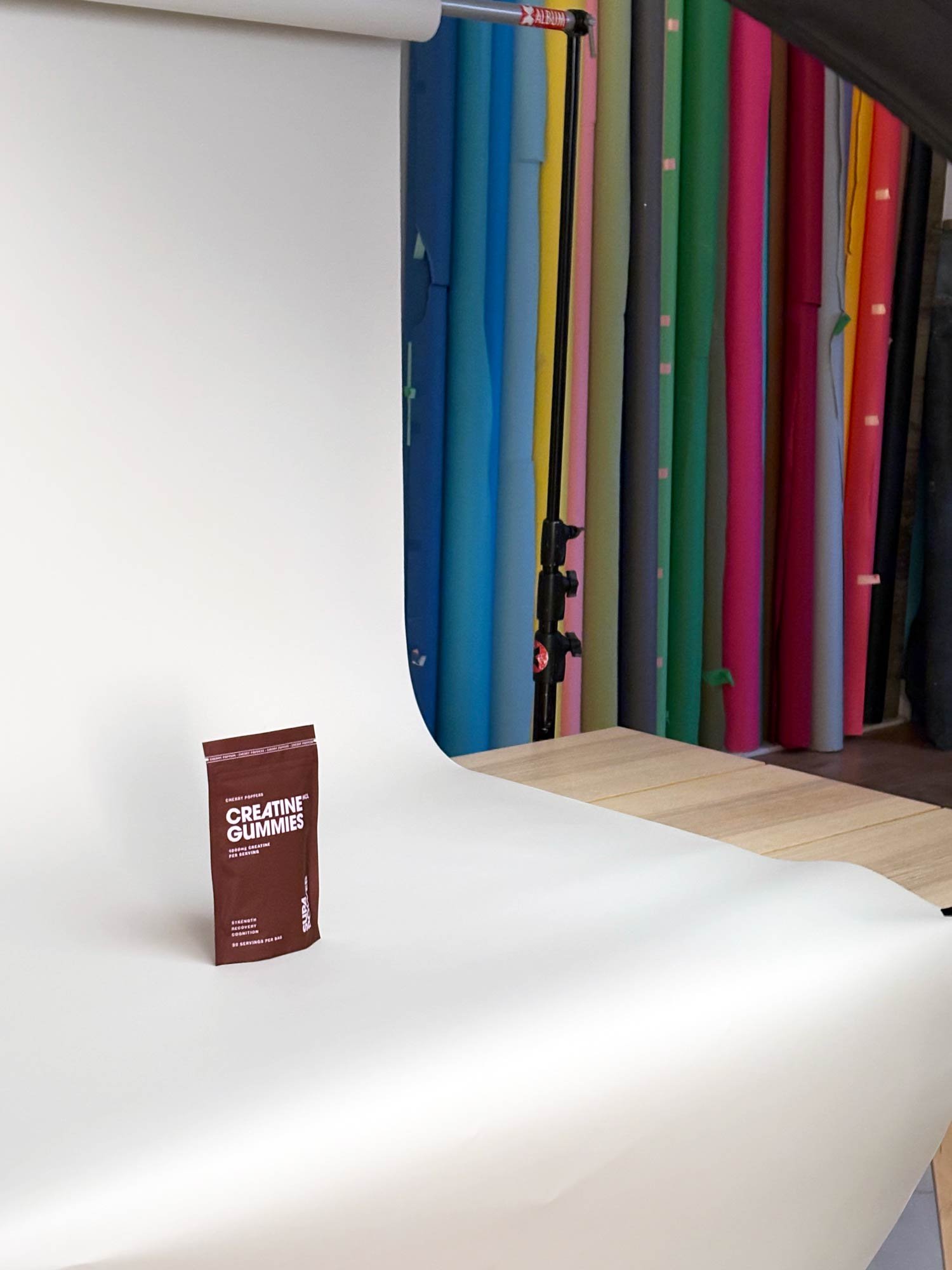
Before approving the beautiful picture, ask this:
- Can I see the design on the actual dieline?
- Where do the French, ingredients, allergens and required panels go?
- What happens across every flavour and format?
- Is the barcode the right size, placement and contrast?
- Which colours and finishes are actually being printed?
- Who is responsible for production artwork and prepress?
If the answer is still “we'll figure that out later,” you are looking at inspiration. Not packaging.