What can this brand own?
The useful difference that gives the design somewhere real to stand.
Packaging has seconds to get noticed, understood and wanted. We design systems that do all three without making production hate us.
Smaller is a Toronto packaging design agency for food, beverage, supplement and consumer brands. We connect positioning, identity, packaging architecture and production-ready artwork in one system.
Tell us what you're makingIt has to carry the idea, explain the product, respect the regulations, survive a planogram and still look good in somebody's hand. That is not a decoration problem. It is a system problem.
We work from the shelf backwards. What needs to read first? What changes across flavours or formats? What can production repeat without slowly wrecking the brand? Those questions shape the design early, not after the hero mockup is approved.
A packaging system is the set of decisions that keeps a product recognizable, understandable and producible across every SKU. It covers what shoppers see first, what changes across the range and how the design survives regulation, production and launch.
The useful difference that gives the design somewhere real to stand.
Brand, product, flavour, benefit and proof — in an order a shopper can actually follow.
Rules for flavours, formats, sizes and channels that keep the family recognizable.
Required copy, claims, tables, symbols and the less glamorous information that still needs a home.
Dielines, substrates, colour, finishes, tolerances and files a supplier can use.
Retail, ecommerce, sell sheets, photography and campaign assets built from the same idea.
We review the category, shelf, search result and retail context before deciding what the pack should say or look like.
We define the family logic early. That keeps one beautiful concept from falling apart as soon as three flavours and two sizes arrive.
The work goes through dielines, required copy, colour, finishes and supplier questions. A packaging project is not finished at the mockup.
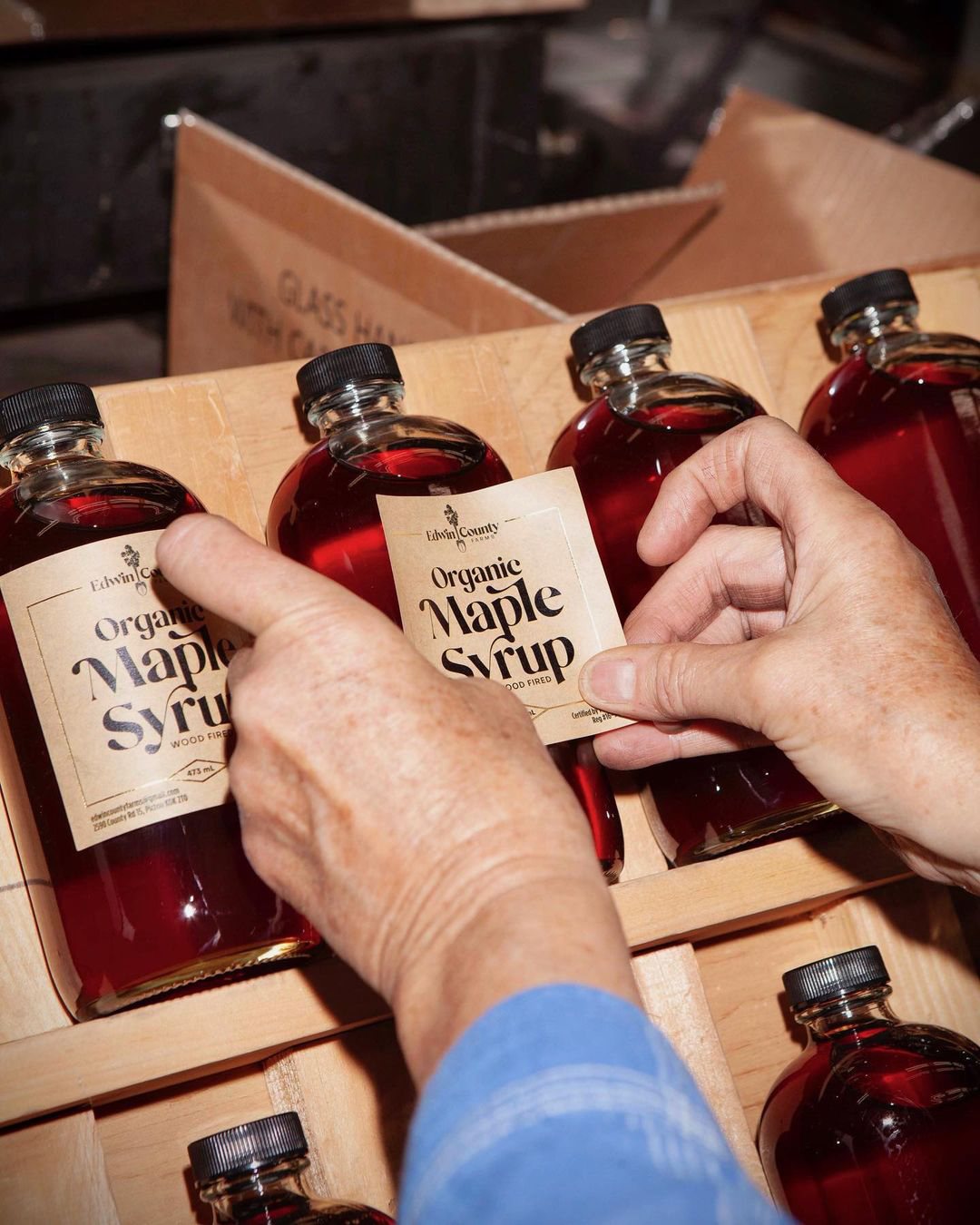
Canadian packaging gets crowded quickly. Bilingual copy, prescribed tables, claims, allergens, net quantity and barcodes cannot be treated like a production cleanup at the end.
We make room for the real information while the hierarchy is still being designed. Regulatory approval stays with the client and their qualified advisor; our job is to build a system that gives compliant content somewhere intelligent to live.
Not an English design with French squeezed into whatever space survives.
Nutrition Facts tables have their own format, type and placement requirements.
Size, contrast and quiet zones matter more than making it look decorative.
The longest flavour name and busiest panel are better tests than the easiest SKU.
Useful references: CFIA food labelling checklist ↗ Nutrition Facts presentation ↗ GS1 barcoding for designers ↗
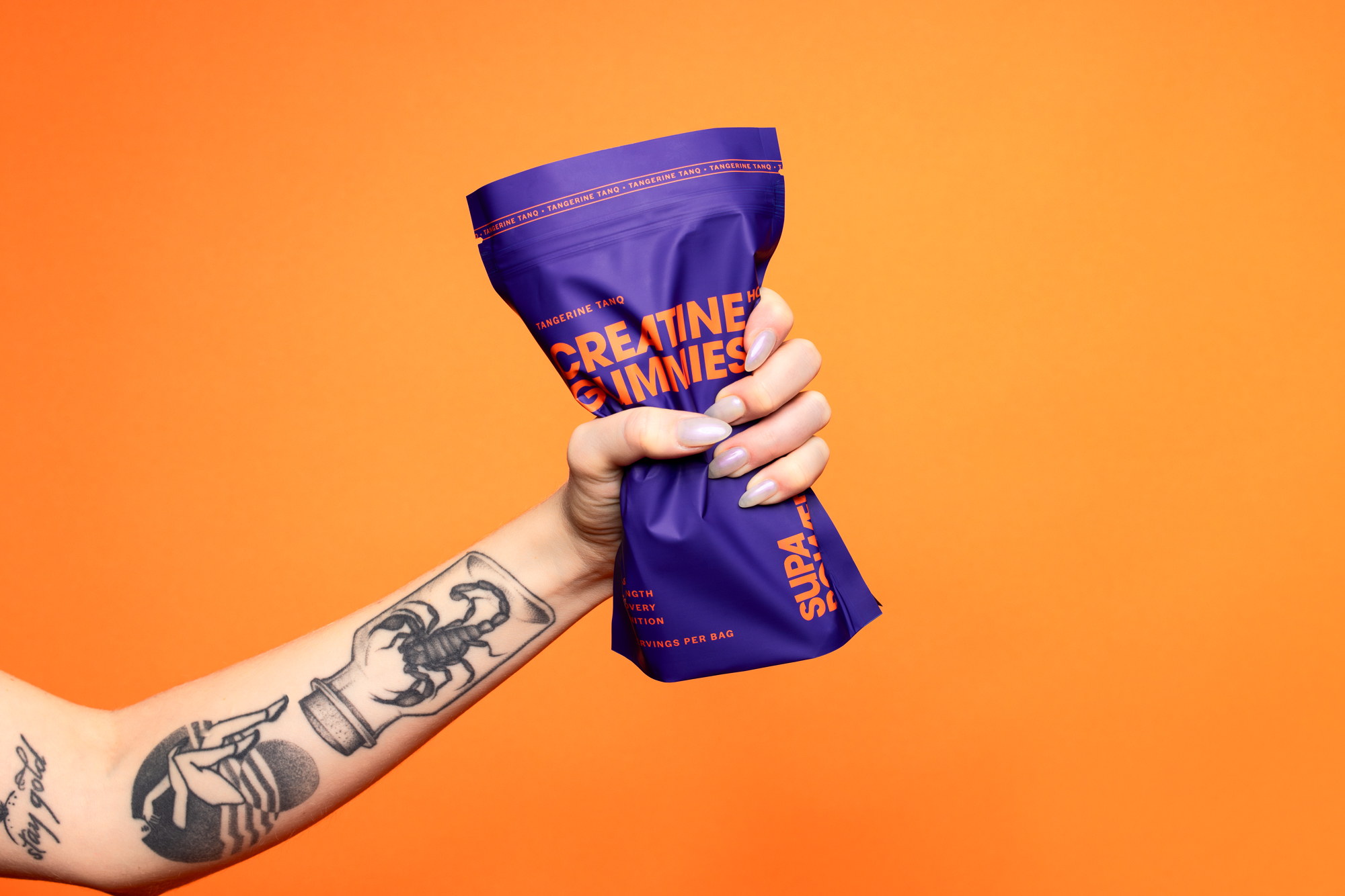
Naming, identity and a flavour-led packaging range built to escape the black-tub category.
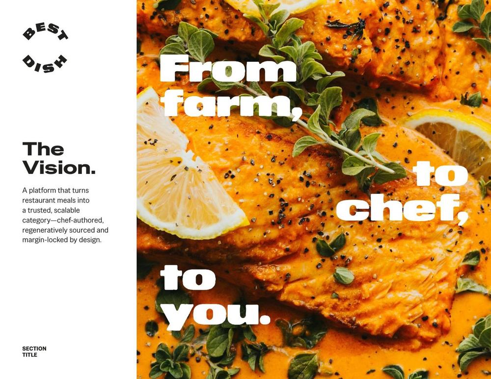
View case study ↗ FoodA sleeve, label and freezer system that made restaurant meals downstairs feel immediately obvious.
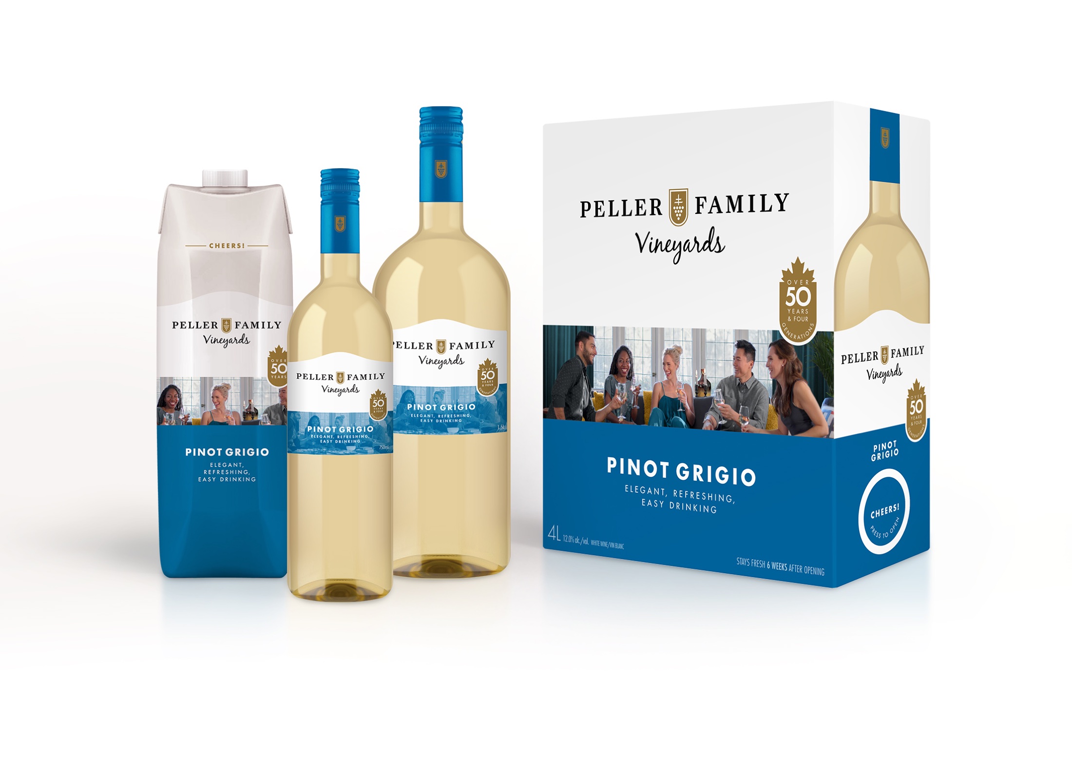
View case study ↗ WineA portfolio system designed to hold varietals, formats, value cues and retail recognition together.
View case study ↗The best packaging is not just noticed. It makes the choice feel obvious.
The things founders and brand teams usually need to know before the brief is tidy.
We focus on consumer packaging, especially food, beverage, supplements, wellness and other CPG categories. Projects range from one launch SKU to portfolio systems across many products.
The scope can include category review, positioning, naming, visual identity, packaging architecture, design concepts, SKU navigation, production artwork, printer handoff and launch assets. We build the scope around what the brand actually needs.
Yes. Sometimes the identity is strong and the packaging system is the problem. We can work inside an existing brand, sharpen what is needed and avoid redesigning things that already work.
Yes. The work is designed to be made, not just approved as a mockup. We support dielines, artwork systems, colour and finish direction, prepress coordination and supplier handoff.
Yes. We plan for bilingual copy, Nutrition Facts tables, ingredient and allergen information, net quantity, claims and barcodes from the beginning. Final regulatory approval remains with the client and their qualified regulatory partner.
That is the point. We define what stays fixed, what changes and how shoppers navigate flavours, formats and sizes before the second, tenth or thirtieth SKU turns into a redesign problem.